PubMatic Brand Refresh
"An independent technology company maximizing customer value by delivering digital advertising's supply chain of the future." That corporate positioning is accurate, but almost entirely invisible as a brand idea. So we set out to change that — to take a positioning statement that lived in fine print and turn it into a full-scale campaign with real creative muscle behind it. Not just a tagline refresh, but a shift in how PubMatic showed up in the market — moving from a customer-benefit message to a market-positioning statement that placed PubMatic as the architect of the industry's next chapter.
Strategy
The Shift
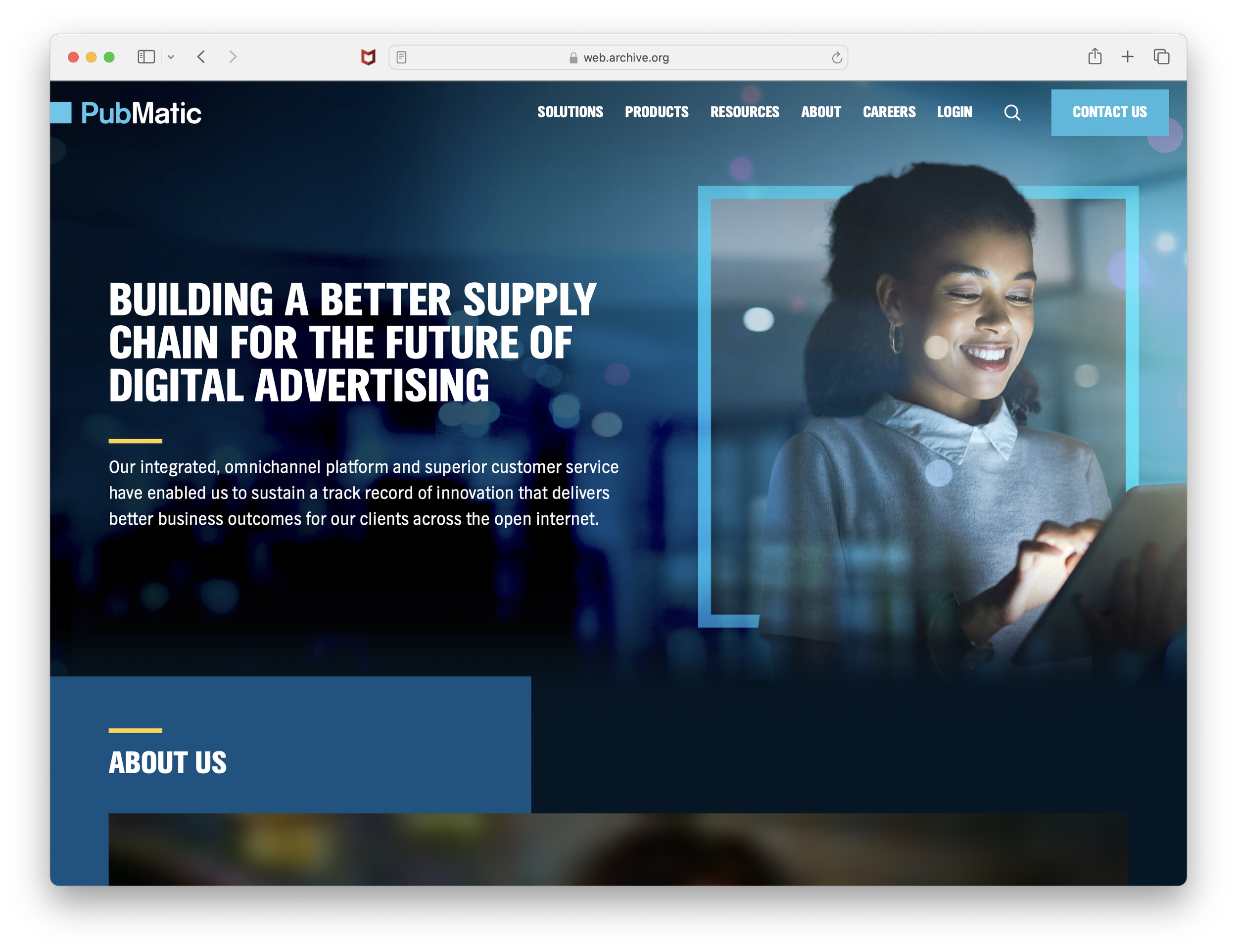
"Building a Better Supply Chain for the Future of Digital Advertising" started not as a brand refresh, but as a point of view. The thought leadership whitepaper published in April 2023 defined PubMatic's vision for the next evolution of programmatic advertising — outlining the new supply chain, the value of independent ad tech, and what the next frontier looked like for publishers and advertisers.
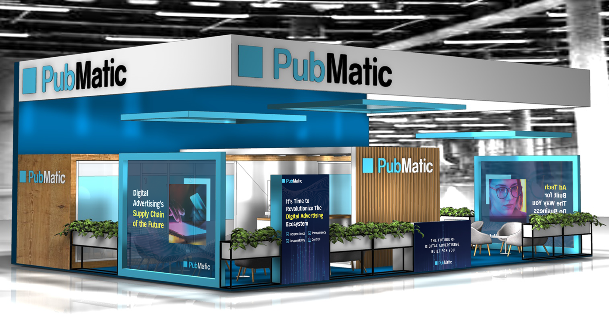
It laid the intellectual foundation that the campaign would eventually bring to life visually and emotionally — a clarification of identity that spoke to PubMatic's role in the industry at large, and a more ambitious claim that required creative confident enough to carry it. We brought this to the surface at dmexco 2023 environmental branding as well as Cannes, and the conclusion is clear: we need a brand refresh to mark this shift.
The Sizzle — A Brand Film Built Word by Word
The campaign centerpiece was a brand sizzle — a cinematic, motion-driven film built entirely around the campaign copy framework. The production followed a full creative pipeline: copy drafted in collaboration with the CMO, the storyboard mapping every line to its visual treatment, and a final motion production built on kinetic typography and dynamic transitions paced to feel cinematic and confident. Pure motion graphics, the words and boxes popped and bounced on screen, and they were translated across social, sales decks, and events — a full campaign system. “Built for you” is still the underlying message, but supercharged to match our ambition.
A New Visual Language
The brand refresh introduced three signature design elements that traveled across every format:
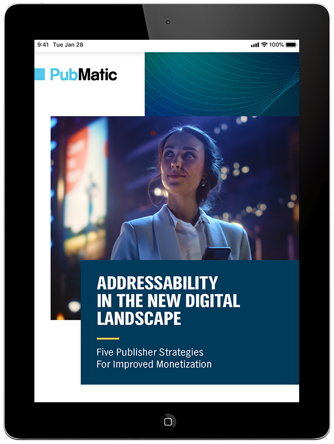
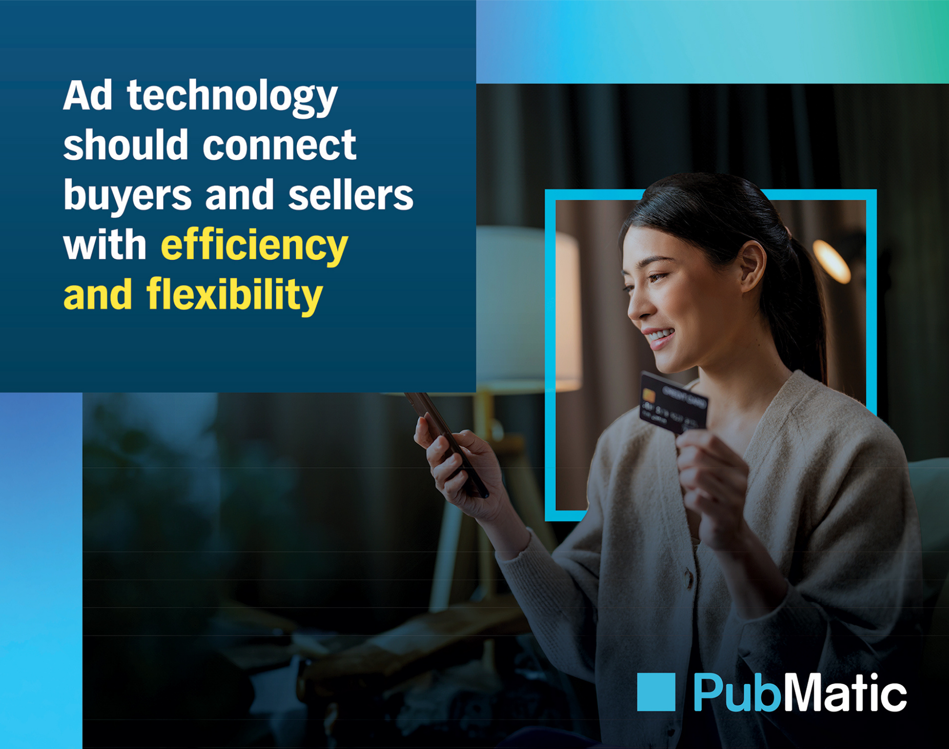
The first and main element was the square window with our signature PubMatic Blue, transforming our logo square into a window to focus on the human, topic, and/or devices. It is a distinct component that elevates our square — once viewed as a restriction into a highlight that draws your attention.
The second element was gradient box treatment — color-filled boxes breaking out of alignment in a staggered layout — created visual tension and momentum across banners, signage, and decks. On pull-up banners, the gradient rectangle breaks out of the top left corner where the logo sits. In presentation decks, the same box pops out at the bottom right of speaker name cards — a deliberate detail that added dimension to what is usually the most forgettable slide in any deck.
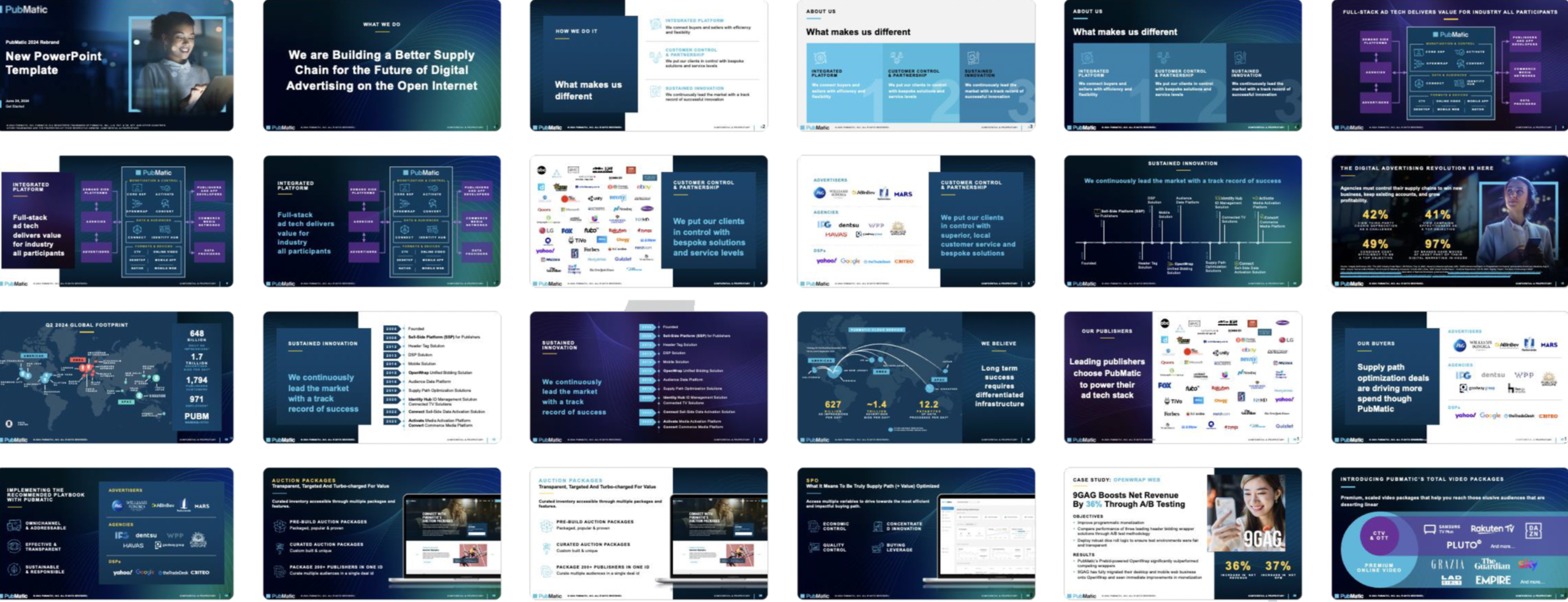
The third element was the wave motif — fluid background elements that brought warmth and movement to a brand that lived in a world of hard edges. Both were codified into a new company-wide PowerPoint template, ensuring the visual identity reached every presentation PubMatic put in front of a customer.
Impact
A boilerplate line became a brand campaign: "Supply Chain of the Future" went from corporate fine print to a multi-format campaign platform with a flagship brand film at its center — giving PubMatic a clear, ownable market position during a period of real industry transformation.
The sizzle set the internal production standard: The 2024 brand film established the creative benchmark for video production at PubMatic — the format, the pacing, the typographic approach, and the cinematic tone that every sizzle produced afterward was measured against. What started as one film became a production template referenced explicitly when briefing new work.
A visual language that traveled: The staggered gradient boxes and wave motif introduced with this campaign became signature design elements across PubMatic's brand — showing up in banners, presentations, events, and video productions well beyond the campaign's active run. From pull-up banners at global events to speaker name cards in executive decks, the same dimensional design logic ran consistently through every format. The updated PowerPoint template ensured the new visual identity reached every corner of the company, from the boardroom to the sales floor.