PantoneView
Digital Platform & Brand Strategy

Pantone is the global authority on color — and it needed a digital presence that lived up to that reputation.
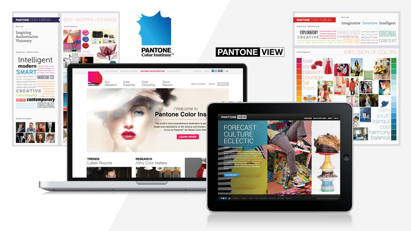
The goal was twofold: bring the beloved PantoneView Colour Planner into an online experience worthy of the brand, and simultaneously launch two new properties — Pantone Color Institute and PantoneView — on a new Sitecore CMS.
Not just a website build. A full brand strategy and digital platform that would cement Pantone's position as the world's leading source of color intelligence across every industry that speaks the language of color.
Strategy
The Central Challenge — Translating a Tactile Icon into a Digital Experience
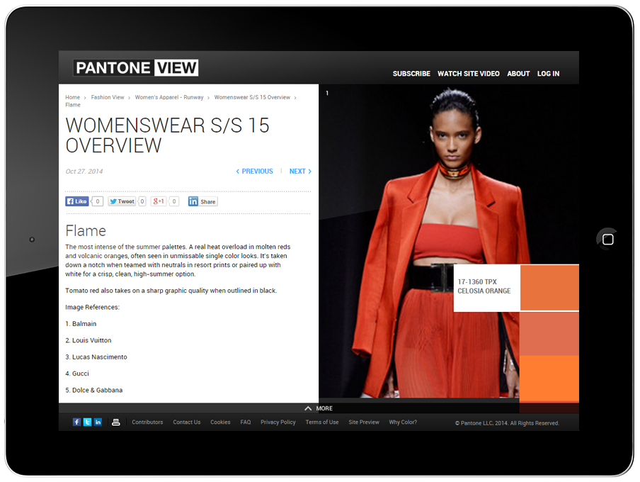
The PantoneView Colour Planner wasn't just a publication — it was an object. Color professionals anticipated it, held it, and trusted it in a way that very few resources in any industry command. The weight of the paper, the precision of the swatches, the authority of the forecasts — all of it added up to something that felt premium and definitive in a way that a screen, by default, does not. The challenge was to translate that experience into a digital format without flattening it — to preserve the sense of discovery, the editorial depth, and above all the forecasting wow factor that made PantoneView the resource color professionals reached for first. The digital platform had to earn that same trust in a completely different medium.
From Print Legacy to Digital Destination
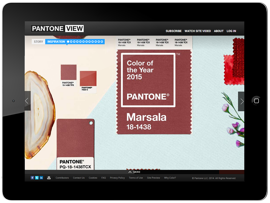
PantoneView had earned its reputation in print — comprehensive color direction, global trend forecasting, perspectives from leading color experts across fashion, interiors, industrial design, and beyond. The digital platform had to carry all of that authority into a new format without losing what made it essential. The experience was designed to serve two audiences at once: the creative professional looking for visual inspiration and trend direction, and the business decision-maker who needed Pantone's expertise to inform product color, packaging, and corporate identity. Color as a creative tool and color as a business asset — both, in one place.
Built from the Ground Up
The project started where every good digital platform should — with strategy. User experience, information architecture, wireframes, and prototypes were all developed before a single line of code was written, ensuring the final build reflected a clear point of view on how users would navigate, discover, and engage with the content. The Sitecore CMS framework was chosen specifically to give Pantone the flexibility to keep growing — adding content, expanding services, and continuing to offer expert color consulting to corporations without outgrowing the platform underneath it.
Subscription Sales Engine
Beyond the editorial experience, PantoneView was built to generate revenue. A tiered membership plan, a preview site, and a demo video were produced as a complete sales toolkit — designed to convert the audience's genuine passion for color and trend into a subscription. The positioning was straightforward: if you need to be at the forefront of color trends across your industry, this is where you come. The demo and preview experience gave prospective subscribers enough of a taste to make the case without giving away the full product.
Impact
The redesigned PantoneView delivered on the hardest brief in the project — translating the tactile authority of a premium print publication into a digital experience that felt equally considered and expert. The result was a scalable, subscription-driven platform that gave color professionals and business clients a single destination for trend forecasting, editorial inspiration, and expert consulting across industries — with a tiered membership model, demo video, and preview site doing the sales work on its own. Two new properties launched on a Sitecore framework built to grow, and Pantone's reputation as the global authority on color had a digital home that finally matched it.