Latest Entries

Creativity + Spam = Smiles

Or it could be titled “When Spam Brightens My Day.”

During my usual routine of reviewing comments and deleting Spam from my blog, I found this desperate call for help:

HELP! I’m currently being held prisoner by the Russian mafia xyzrxyz pe[n]is enlargement xyzrxyz and being forced to post spam comments on blogs and forum! If you don’t approve this they will kill me. xyzrxyz pe[n]is enlargement xyzrxyz They’re coming back now. xyzrxyz [company-x] xyzrxyz Please send help! nitip [company-x]

Not very often I found myself laughing over spam email or comments. This Russian Mob Kidnapping spam definitely is a rare case.  The story line, the desperation… Such creativity. Kudos, whoever you are.

p.s. I hid the company name and, of course, the original spam comment does not have any [ ] in it. 😉

QR Codes + Graffiti > Commerce

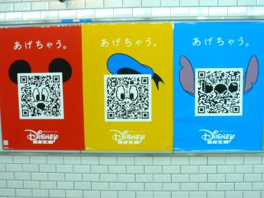
Everybody is talking about Calvin Klein’s “Get It Uncensored” QR Code billboard in SoHo. So what. It’s been around in Japan for ages (well, maybe not ages, but since the 90’s). Invented by Denso-Wave in 1994,  it’s now pretty much on every printable/projectable surface.

The US market is finally catching on and we started seeing commercial uses such as the Calvin Klein billboard or the Nordstrom storefront, or as tourism tool being utilized by European cities like Bordeaux, France, with its Digital City Project or Senigallia on Italy’s Adriatic coast with its QRCity. And yeah, it’s the next biggest thing and its cool. But it has to be more than commerce or tourism.

Then came the Berlin-based urban artist Sweza. Since graffiti are always removed by either the local authorities or property owners, he decided to photograph the graffiti to preserve it and after the graffiti was removed, he placed a QR code in the exact location, which shows you the original. It’s QR code acting as graffiti, but cleaner. Very clever.

Taking that a step further, Digit, a London-based interactive communications agency, is QR-Coding graffiti and making it a talking point. Called I Could Do That, the project basically stems from how everyone always has an opinion about different urban art. A QR code is placed next to each graffiti/art piece which brings you to a site where you can post your comment or read other people’s. So now the graffiti becomes an invitation to a dialogue, creating a reciprocity of some sort.

See samples of comments on Vhils piece above.

For me, it allows the city dwellers/walkers to have a kinship with the concrete you walk on and the walls you pass through. It is “if this walls could talk” times ten. And I like that.

End notes: Thanks to 2d code for being such a resource for all things QR code. What’s the future? I see on-the-spot public voting (from policies to ideas) and online-offline dialogue (think conferences or soapbox orations a la Hyde Park) to QR code as bouncers (yup, you’re not on the list, buddy!). It’s going to be a lot of fun.

If you have any interesting ideas on QR code application, let me know.

Glorious! Soups: Super alphabet soup

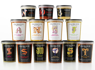
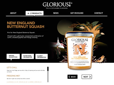
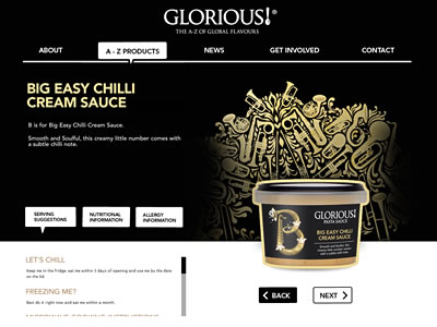
Glorious! Soups® packaging caught my eyes when browsing through I Love Dust‘s portfolio. Beautiful illustration and typographic approach sets this packaging apart. Glorious! Soups® takes alphabet soup to another level.

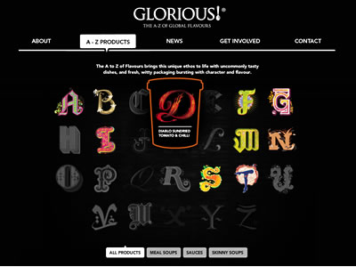
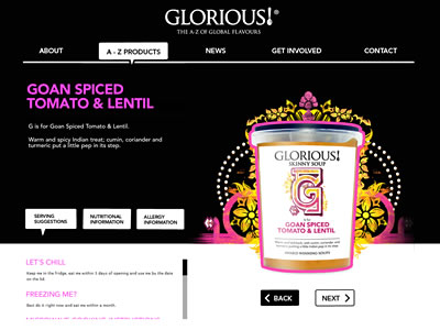
Glorious! Soups®‘s simple black site allows the letters of the alphabet—an ‘A to Z of Global Flavors’—prominently displayed. Iconic, bespoke illustration represents each letter, showcasing authentic global influences and flavors of each product. The illustration is well done (if you know I Love Dust’s work, it’s not surprising at all).

“We wanted to build brand that was bold, adventurous and gutsy to inspire people to try out the new product, ” explains Mandy Taylor, commercial director at Glorious!. Working with Glorious!’s branding agency, Lambie-Nairn, I Love Dust has successfully delivered just that.

The new Glorious! Soups is bold yet eloquent, bringing some ‘zing’ to boring ol’ soups and sauces. It’s simply stunning—both the concept and the design.

How can you not love “M is for ‘Malaysian Chicken'” with delicate Asian flower motif while “T is for ‘Toulouse Sausage and Bean'” and is flanked by legs of can-can dancer?

The Geometry of Pasta

The Geometry of Pasta is not just a recipe book from critically acclaimed chef, Jacob Kenedy. It is a stunning book of over 100 recipes designed in black-and-white that reveals the science, history and philosophy behind spectacular pasta dishes from all over Italy.

It’s designed by award-winning designer, publisher and Creative Partner at Here Design, Caz Hildebrand, who is also responsible for other sumptuous cookbooks by Nigella Lawson and the Hairy Bikers.

The book presents a striking fusion of design and food:  “The book tells you everything you need to know about cooking and eating pasta like an Italian.” The punchy graphic design paired with simple recipes is cheeky, yet efficient. It’s gastronomic pop art, and I want a giant print of the cover as wallpaper in my kitchen!

Visit The Geometry of Pasta for more.

Jay Maldonado for Zoo York: Locals Only

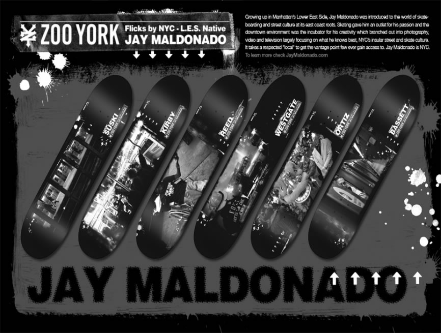
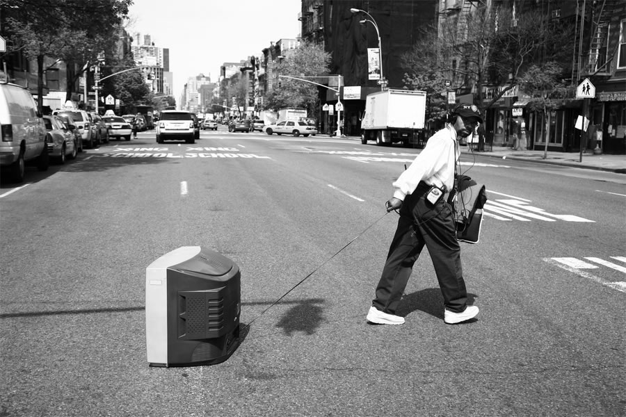
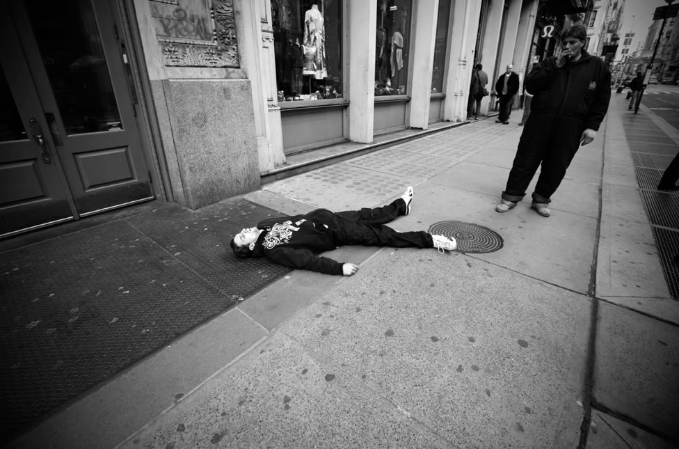
Zoo York has teamed up with NY photographer and skater Jay Maldonado.  The L.E.S native (he grew up in La Guardia housing projects on Clinton St.) captured beautiful images of a day in the life of New Yorkers for the Locals Only board series.

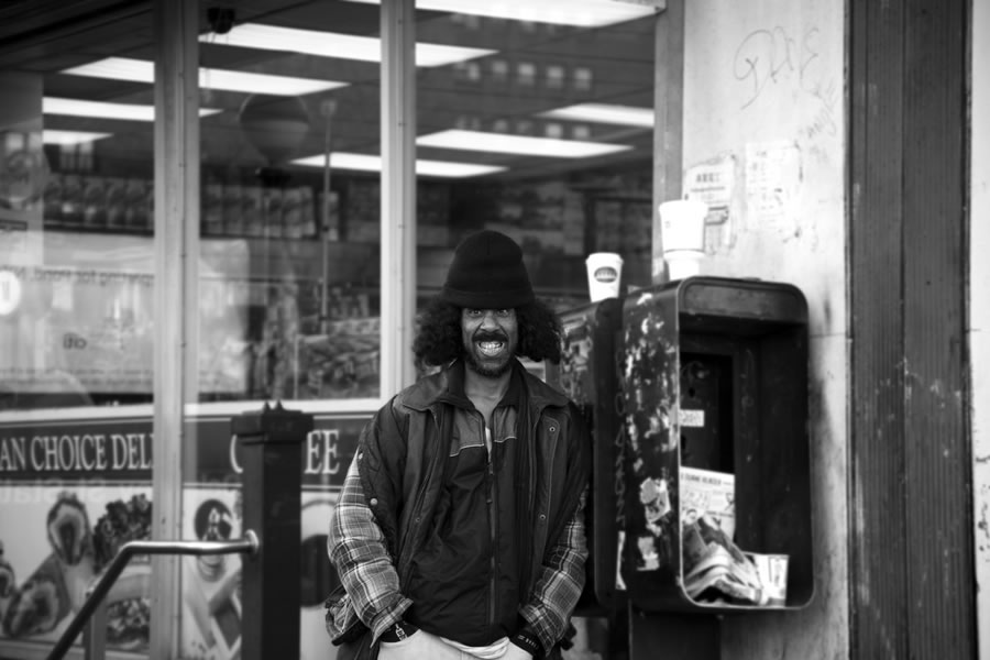
The stark B&W portraits captured the grit and texture of NYC street corners. He admits when he goes out shooting, he’s looking to capture some sort of moment so he can get across the right feeling. And when you go through his work, he’s spot on.

On shooting with NYC as a backdrop, Jay couldn’t ask for more:

There are so many different things to shoot, so many different people, buildings. Not every corner is alike and not to mention the great landscape as your back drop. I couldn’t ask for anything better as a backdrop.

I totally agree. Read Zoo York’s interview with Jay.

For more on Jay, visit jaymaldonado.com.


Red Pepper Flakes © 2008 - 2011. All rights reserved.

RSS Feed Content by Imelda Suriato