Latest Entries
To 3D or not to 3D
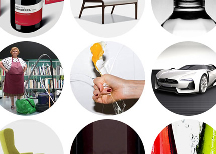
I always like the Herman Miller’s Thought Pile from Freedom + Partners. Then I saw the new site done in 3D and I was caught between “whoa… awesome!” initial moments and then not loving it as much as the un-3D version. It’s definitely an interesting interface, with the 3D depth of field accentuated by some graphical elements (I especially like the circle of logos contrasting the perpendicular plane.
I wonder what the thoughts are behind this redesign and whether they are going to change it again once 3D is no longer the “it” thing to do.
Meanwhile, FirstBorn created The Mountain microsite for Sport Chalet with inspirational 3D use of triangular panels. Nice touch on using the same triangular panels intermittently as part of design elements (e.g. colorful loading panels, corners of popup boxes). Sad note: It does make my browser grind to a halt when I left it on for a few minutes.
ReBranding Winners
A nice collection of redesigns compiled by ReBrand for 2009. I like that there are many before & afters so you can compare, smile or smirk.
Via: Brand New
Puma Roma 68
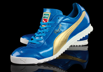
I laid my eyes on these beautiful, azure Puma from PumaArchive. These would be perfect replacement for my gold Italian Cult that I can’t find anywhere anymore.
Font Solver!
I kept forgetting to post this WhatTheFont tool, but here it is: no more “Does anyone know what font this is?”


