Latest Entries

Musée Hergé: Everything Tintin

Musée HergéI love this little find via Air Canada’s enRoute magazine. I don’t remember my first Les Aventures de Tintin—I was maybe 5—but I remember being engrossed in it, letting Tintin and Snowy taking me with them on their adventures. So definitely, Musée Hergé should be on my list when I ever get to Brussels.

Anyway, I love the logo and supposedly it has a really good restaurant, Le Petit Vingtiéme, named after the weekly newspaper the cartoonist was first published in.

Looks super cute with Tintin, Snowy, Captain Haddock & the gang everywhere. BTW, don’t be super-impressed with my foreign language repertoire; I was reading the Indonesian version. C’mon, I said I was 5! 🙂

Fred Perry is one cool cat

Fred Perry Tell us your story

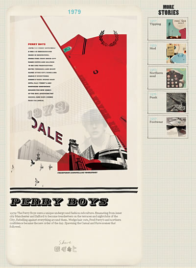
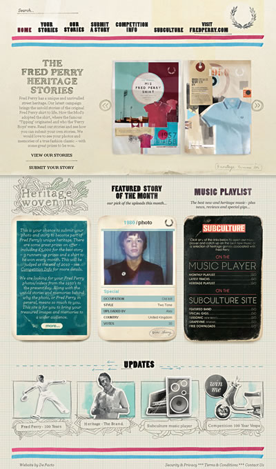
Talk about retro cool. Fred Perry, the tennis-inspired British clothing brand, wants you to tell them your story on Fredperrytellusyourstory.com.

Fred Perry Tell us your story

In this latest campaign, the brand wants to bring the untold stories of the original Fred Perry shirt to life.  I love the graphic treatments, the colors, the cutout styles… everything gives out a very authentic, retro feel. Checkout their old ads.

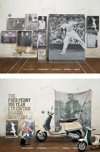
On top of the retro, there is the sleekness of history: Fred Perry – 100 Years.

Fred Perry - 100 years

Yes, it is sleek, yet still very much in line with its retro and heritage spirit. Very authentic indeed and  I like it a lot.

NY, NY, NY, NY by Hiroyuki Ito

NYTimes Lens

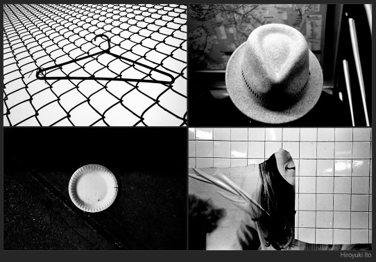
Check out “New York, New York, New York, New York” article by Hiroyuki Ito in NYTimes’ Lens Blog. It’s a collection of photo grids (called “Transfer of Guilt”) where each grid contains four snapshots that were taken in New York from 2006 to 2009. They were all shot in black-and-white film, developed and printed on resin-coated paper before being scanned and assembled into grids.

Very street photography, very snapshot, very New York. See the full-screen  slideshow.

Boarding Pass Redesign

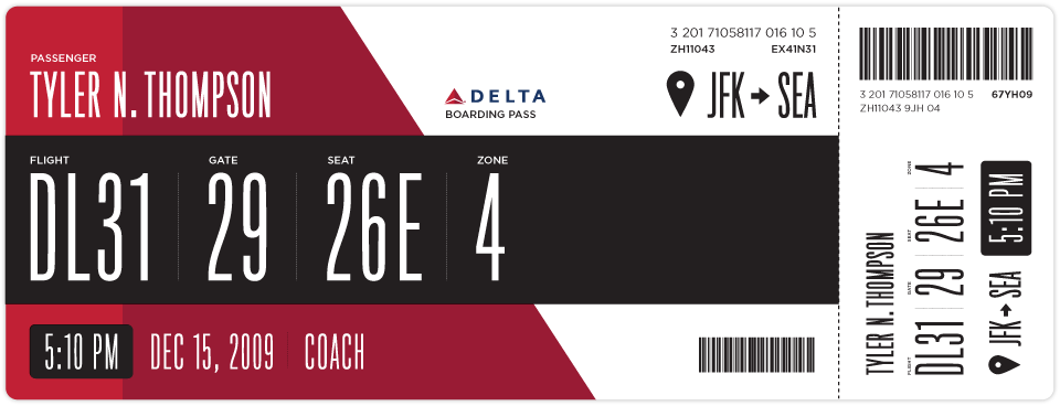
Interesting take on Delta’s ugly boarding pass by Squarespace Creative Director, Tyler Thompson. Last year, he decided to embark on his own take on boarding pass design after looking at his boarding pass at JFK and wondering “what the hell…” The result is a beautiful and well-architected boarding pass design. His initiative invites an interesting conversation by other designers as well as their own redesigns.

I personally like the sketches he did on his moleskin.

Tyler Thompsons boarding pass redesign sketches

Read all about it.

Nike Music Shoe

Nike Music Shoe is the latest project by Daito Manabe, Tomoaki Yanagisawa W+K Tokyo and others (4nchor5, rhizomatiks) turning Nike’s free run+ shoe into a music instrument. Created using MaxMSP.

Disclaimer: Shoes sold at retail will NOT make music when bent or twisted. 🙂

Via Creative Applications


Red Pepper Flakes © 2008 - 2011. All rights reserved.

RSS Feed Content by Imelda Suriato