Glorious! Soups: Super alphabet soup
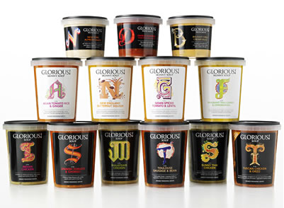
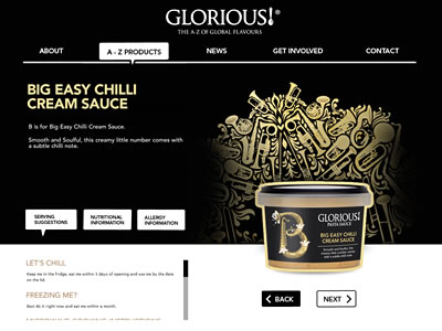
Glorious! Soups® packaging caught my eyes when browsing through I Love Dust‘s portfolio. Beautiful illustration and typographic approach sets this packaging apart. Glorious! Soups® takes alphabet soup to another level.
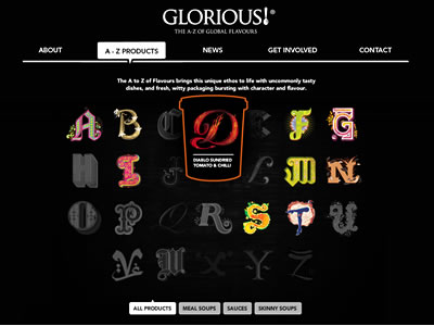
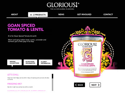
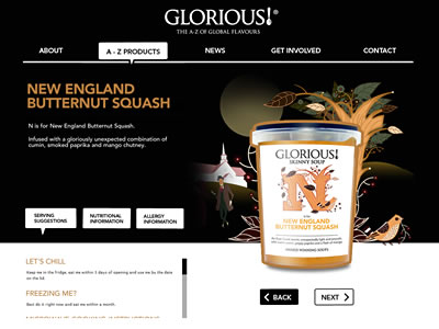
Glorious! Soups®‘s simple black site allows the letters of the alphabet—an ‘A to Z of Global Flavors’—prominently displayed. Iconic, bespoke illustration represents each letter, showcasing authentic global influences and flavors of each product. The illustration is well done (if you know I Love Dust’s work, it’s not surprising at all).
“We wanted to build brand that was bold, adventurous and gutsy to inspire people to try out the new product, ” explains Mandy Taylor, commercial director at Glorious!. Working with Glorious!’s branding agency, Lambie-Nairn, I Love Dust has successfully delivered just that.
The new Glorious! Soups is bold yet eloquent, bringing some ‘zing’ to boring ol’ soups and sauces. It’s simply stunning—both the concept and the design.
How can you not love “M is for ‘Malaysian Chicken'” with delicate Asian flower motif while “T is for ‘Toulouse Sausage and Bean'” and is flanked by legs of can-can dancer?
