Archived entries for nice work

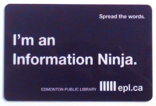
Information Ninja library card

Information Ninja - Edmontont Library Card

I want this library card!

Brilliant branding and campaign by Edmonton Public Library, utilizing guerrilla campaign of great copy on stickers as well as the Edmonton Improv group to help Spread The Words.

Edmontont Public Library Campaign

This effort is just excellent. I love it! It’s not only because I spent a lot of time in stuffy old libraries and book stores growing up (free stuff to read!).

p.s.: Yes, chicks do dig big brains.

Making sweet real web fonts

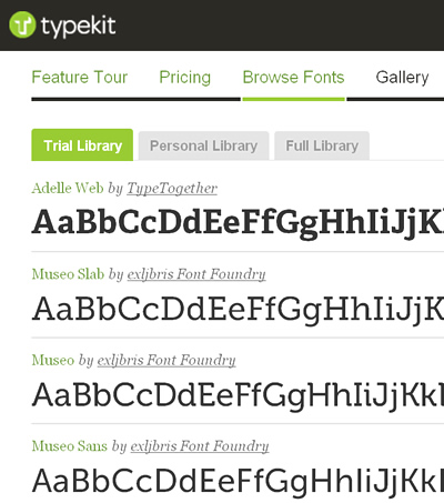
Typekit

The days of HTML built-in fonts are now over. Well, sort of.

Typekit, a product of Small Batch Inc. (who is now not so small anymore after their first round of VC funding), is offering beautiful, real fonts for use on the web. This means headline or title graphics don’t have to be created and there really is no need for sIFR anymore.

The best part: The subscription-based service offers Open Type fonts from some of the world’s best type foundries to be used gloriously on the web.

The fee is very minimal, but if you’re a super-starving designer, you can start with their free trial package.

Then comes Google Font API and Directory. No worries, Google isn’t trying to bully Typekit. Both companies openly collaborated to get Typekit Font Events into the open source project WebFont Loader. To boot, Google’s web fonts can be accessed from Typekit so if you’re using both services, there won’t be any compatibility issue.

So it looks like Typekit and Google Fonts are making sweet, sweet real web fonts together. The best part, of course, is the fact that designers will now be able to explore web font usage without having to worry about production, search engine-friendliness, Mac vs. PC font fibs, and the need to buy every single font you want to use for comps.

Yes, I’ve been there, knee-deep in “beg, borrow, steal” font territory. Can you smell the freedom now?
Heatherwick’s Fuzzy UK Pavilion

Thomas Heatherwick‘s fuzzy UK Pavilion at Shanghai Expo 2010 blurs the architectural lines quite literally. Called Seed Cathedral, the see-through building is just fantastic. The 40-year-old Heatherwick thought of everything in awe-inspiring details, from the moving fiber optic-like strands to the embedded plant seed storage at the tip of each .

I can’t help but be a fan after walking up the trippy, sweeping staircase at the SoHo’s Longchamp store, appropriately named La Maison Unique. Just look at his portfolio from the Harvey Nichols installation in 1997 to Longchamp’s Zip Bag to the caterpillar-like Rolling Bridge.

You have to see it to believe his scope of imagination. It’s simply Wow.

Richard Perez & wonderful Skinny Ships

Kudos to Richard Perez (aka Skinny Ships) on being the fifth guest post’r to Friends of Type. Take a look at his work: Beautiful typography, bold, smart design with a wink. Just like to give a little nod for job well done.

Bogotá Beer: Es bueno

Bogotá Beer Company

Love the new identity for Bogotá Beer Company. Striking use of color, type treatment and their iconic Ford delivery trucks. Kudos to Lip. Ltda., the Bogotá Colombia-based design studio. No work shown on their single-page website so I scoured the web for their work. Check it out:

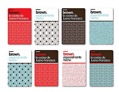
Brown Identity - Lip. Ltda.

Brown Identity - Lip. Ltda.

See more of Bogotá Beer Company’s identity at CommArts.


Red Pepper Flakes © 2008 - 2011. All rights reserved.

RSS Feed Content by Imelda Suriato