Archived entries for nice work

Timberland: Best foot forward w/ 3D & more

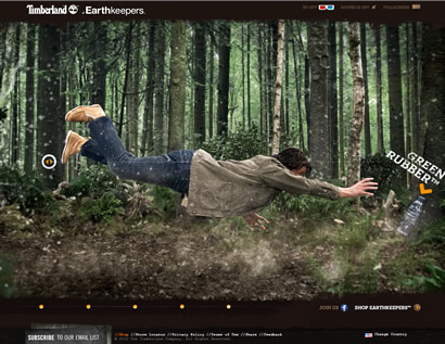
Timberland is pulling all the stops for its eco-friendly Earthkeepers collection with “Nature Needs Heroes” campaign from TV and print, to social media and a microsite with 3D technology. I first thought it was just a marketing ploy, using the “3D” term to entice visits. I’m glad to find that I was wrong.

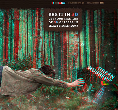
Sure you need a pair of 3D glasses, which you can grab at its retail locations. I’m pretty sure it would look dope—no, I don’t have 3D glasses laying around in the office so I’m seeing it 2D—but I can totally “see” the 3D experience.

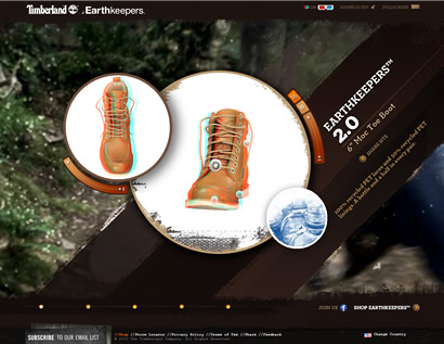
The landing page puts you in the right spot, with a guy floating in the air attempting to grab a plastic bottle (eco-friendliness is the theme throughout the campaign). You can rotate him and at different points in the rotation, different elements are highlighted, from the apparel to the video. The product detail view offers another excellent use of 3D modeling with 360°-view (the boots one is very cool with dual-angle view), which works great even while zooming.

Yeah, it loads a little slow, but trust me, you want to see this. It is quite impressive.

After seeing this, I decided to checkout the rest of Timberland.com and I was quite surprised with the transformation. (Note: Last time I visited the site was in early spring).

Timberland—Women’s

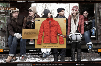
Timberland Women’s microsite welcomes you with a full-screen video of models enjoying the outdoors and the message “Go out and be you”. The overall branding is right on: The look is fresh and natural yet sophisticated, just a tad rugged to reflect the passion for the outdoors, using natural elements like kraft paper as a nod to the eco-friendly philosophy of the brand and the handwritten notes add a touch of youth and a warmer feel.

What I like most is the Get The Look section where you can browse through the campaign photos and click on the different marked items on the photos. The Gallery showcases different looks by women who don’t look like models, a “real people” aspect to them which I found pleasing. There’s also a behind-the-scene, get-to-know-me approach with On Location (B-roll of the campaign shoot) and Meet the Designers (video interviews with the designers behind the apparels).

Timberland—Heritage

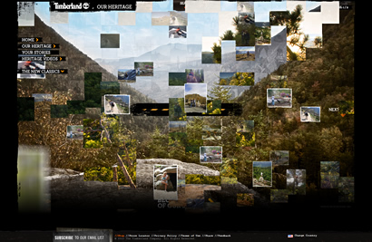
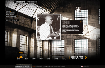
Timberland Heritage offers a look through the brand history in nice sepia tone spiked with social element: You’re invited to “Become Part of Our Story” and you’ll be part of the photo montage on the microsite. On top of that, there are other pretty interesting things to check out, from the videos to “The New Classics,” which contains Build Your Own, the Abbington Collection and the Timberland Boot Company.

Timberland—Build Your Own

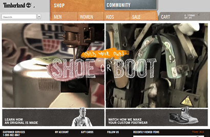
Timberland Shop is pretty standard e-commerce site with a pretty cool “Build Your Own” with “SHOE” or “BOOT” options. (Still a bit buggy—I encountered a few broken links when trying some of the women’s boots.)

Timberland Boot Company

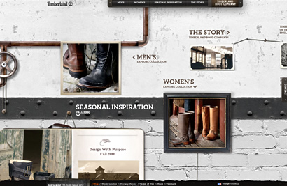
Meanwhile, the Timberland Boot Company is a neat little microsite that showcases special collections that are inspired by a time of transition in New England and Northern England. The sections of the microsite are displayed as framed art on a white-washed, weathered wall in tune with the pioneering spirit feel. This type of draggable Flash site has been done many times before so the microsite is just a nice little thing to look at but, my goodness, those boots are fetching!

That wraps up the Timberland re-vamped online brand. Don’t forget to visit Earthkeepers to join in the movement and meet “like-minded people from all over the world intent on doing the little things and the bigger ones.”

I’ll leave you with these fun facts from Timberland Eco-Love Survey in April 2010:

The survey found most men have high expectations for the women they date or associate with:*

  • Must Love the Earth. Fifty-four percent of men would question whether to start a relationship with someone who litters. Others would ponder if a woman was worth dating if she doesn’t recycle (25%), leaves the lights on when not at home (23%) or drives a gas-guzzler (21%).
  • Guys Dig Green. One-quarter of men think “green” women make better life partners (24%) or friends (27%) than those who aren’t so environmentally responsible.
  • Plan an Eco-date. Grab your hiking boots and a shovel—more than 40 percent (41%) of men would be more interested in an “adventure” date like hiking or rock climbing or a charity or service-focused date like tree planting, rather than the traditional “dinner and a movie” date.
  • Walking the Green Carpet. When it comes to today’s hottest “eco-lebrities,” men say Cameron Diaz (27%) and Kate Hudson (26%) would inspire them to go green.

*Source: The Timberland Company (via Market Wire)
Gastrotypographicalassemblage!

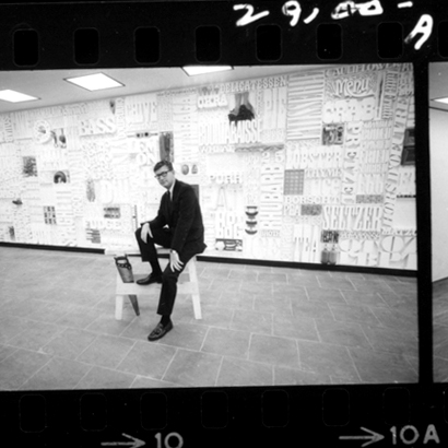
Lou Dorfsman in front of Gastrotypographicalassemblage

When I saw this word, I can’t help but to smile and write about it.

What is it?

Gastrotypographicalassemblage is the name of the 36-feet long, 8-feet high 3D-typographical artwork by American design legend Lou Dorfsman in 1966 for the Eero Saarinen–designed CBS Building’s cafeteria. As an art director for CBS Radio Network (from 1946 to 1987), Dorfsman was responsible for all the building’s graphics, including the hand-milled wood type that listed all the foods and ingredients. In addition, the typography was done by Herb Lubalin and Tom Carnase under his art direction.

How delightful… until it was torn down and tossed aside in the early 90s. If it weren’t for the efforts of designer Nick Fasciano, and ID magazine writer Eve Kahn, it would have been gone for good.

Gallery photo by Christian Carlsson

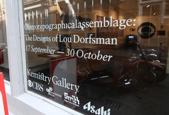
What brings the word to mind today is an exhibition of Dorfsman’s work under the same title which runs until October 30 at Kemistry Gallery in London. Sixty original print advertising for CBS will be displayed along with the star attraction: The specially-created half-scale, photographic reproduction of Gastrotypographicalassemblage.

Go to Creative Review to read more about the exhibit and the making of it.

For more on the original artwork, its almost demise & restoration:

Also read The Four Lessons of Lou Dorfsman, a tender tribute by Michael Beirut when Dorfsman passed away in October 2008.

_________________________

Photo credit: UnderConsideration

Alcohol brands online: Summer 2010

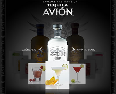
Before the 4th of July weekend, Squeaky was asked by Tequila Avión, a premium tequila brand, to help with its digital presence. There was a sense of urgency to “elevate” the brand: Tequila Avión was being written into HBO’s Entourage by the creator, Doug Ellin, for episode “80: Buzzed” to be aired on July 11th (yes, in one week!). They asked for our help because their existing site didn’t do much for the brand.

We opted for a Facebook tab to “Experience Tequila Avión” which allowed the three different tequilas to be featured with custom recipes that are simple and sleek to reflect the premium product, yet lending the small, independent brand a grassroot feel by utilizing their Facebook fans. The strategy and execution were well received by the fans and the brand team, and we did it in a super crunch time!

During the discovery and strategy phase, we scan the web to see what other alcohol brands are doing online. (Trust me, there are a lot of them out there.)

Here are a few that stand out:

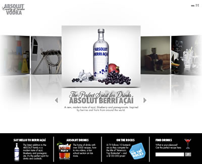
Absolut Vodka—Absolut-ly on top

Absolut has consistently done very well with their brand messaging. They are “smart, stylish, creative and witty” and they seem to always get it right, from web to social media to mobile.

Facebook Fans: 534,407 fans

Facebook Campaigns:

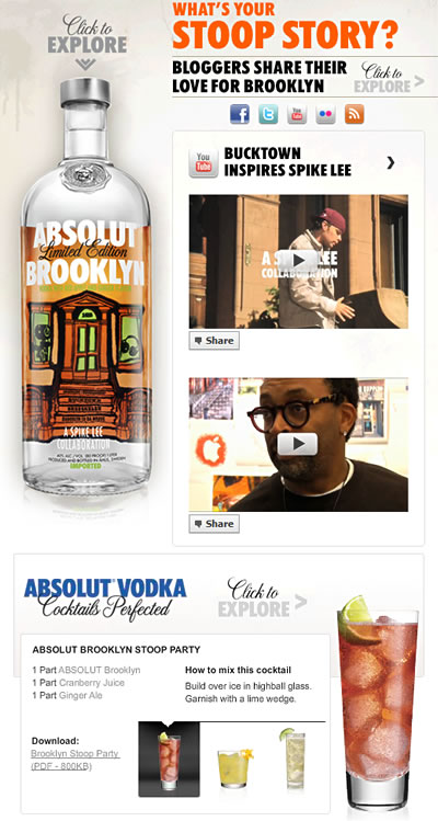
  • BROOKLYN: What’s your Stoop Story? Celebrating Summer, Bloggers sharing their love for Brooklyn, Spike Lee, etc.
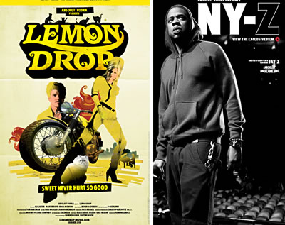
  • Lemon Drop: To promote Lemon Drop the movie starring Ali Larter
  • NY-Z: Documentary with Jay-Z – video released on Facebook first
  • Berry Acai: With Zooey Deschanel

Remember their ABSOLUT Anthem video from summer 2009?

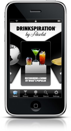
Mobile: Absolut’s iPhone app has the nicest interface with a card-flicking motion that has a nice stickiness to it.

In addition, Absolut is the first brand who embraces the LGBT market. The latest commercials I saw was during Ru Paul’s Drag Race (yes, the show is my guilty pleasure. I just love Ru!)  where LGBT personalities (from Santino Rice, finalist on Project Runway to journalist / editor / author / TV personality Merle Ginsberg) of shared their coming out / standing up story in a bar and Absolut creating different drinks named for them. Absolut was a sponsor and the segment with Berri Açaí is hillarious.

Summary:

I’ve always been a fan of Absolut, every since I saw those iconic Absolut print ads (Absolut Brooklyn is still my favorite and that was out in the 90’s). The fact that Absolut has managed to move on every new medium successfully and speaking about the brand consistently is an achievement not many brands can claim they did well.

So Absolut, from one vodka drinker to another: Very well done!

Grey Goose Vodka—Less than premium

When Urban Daddy’s The Dashboard came out in August and I saw the Grey Goose bottles on the bottom right corner, I was pretty excited to see what they have to offer. Unfortunately, the nightlife assistance tool is created for Urban Daddy and only sponsored by Grey Goose. So it wasn’t a creative push from the vodka brand.

The tool, albeit the really sleek 3D-ish design, is only half as cool and smooth as the Sprint “Plug into Now” dashboard, which came out almost 2 years ago and is still being kept up-to-date nicely.

Facebook Fans: 148,035 fans

Facebook Campaigns:

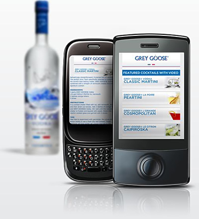
  • L’Orange: Downloadable Cocktail cards (go to Photos, with simple “Drag to desktop and print” instruction), Video of their TV commercial, Mobile Recipes App (Grey Goose Mobile Alert).
  • Boxes: Pocket Cocktail iApp, Send a Toast to friend (which links to their website)
Note: Unfortunately, all the campaigns above are no longer available.

Mobile:  Dubbed “A Guide To The Extraordinary, Delicious and Exquisite,” I felt that it was nice but lacking the pizazz that Absolut’s  iPhone app brings to the table.

Hornitos Tequila—Ballsy!

Facebook Fans: 48,1545 fans

Facebook Campaigns:

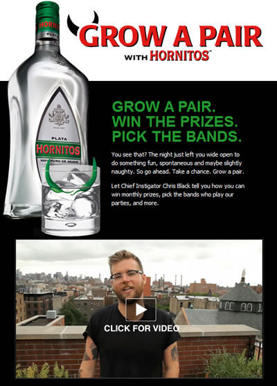
  • Grow A Pair:  Showing their commercials + monthly contest. Currently running ads with videos pointing to Facebook
  • Recipes: With an easy Print, Share, Comment & Like links under each recipe

What stuck was the hilarious commercials from their “Purer Than Your Intentions” campaign with “Cougar Phone” and “Doris.” Watch ’em!

Other notables:

Patron Tequila

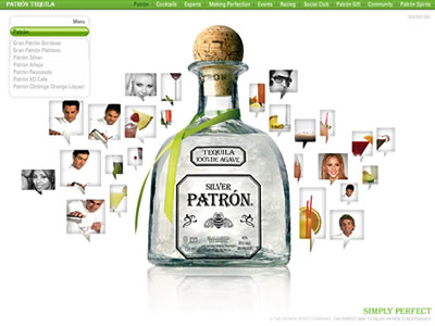
With its recognizable bottle simply at the center on the website, surrounded by hovering, comment-shape features, the brand strongly presented itself as a premium spirit brand. I like it: It’s clean, straight-forward and it feels premium.

Was the hovering of the elements done intentionally to mimic the bee in the logo? I don’t know but now that I’ve noticed it, it’ll be interesting to find out.

901 Tequila

This is Justin Timberlake’s tequila. It’s not a spoof. He can now add “Distiller of fine tequila” to his list of accolades. The tequila is supposedly super smooth, according to tequila aficionado who tried it. Well, if you have what it takes to create a product, why not, right?

The website opens with a looped video of this girl, looking at you and, I have to admit, if you leave it on for a while, it’s kinda creepy. Within the FILMS section, you can watch its sexy smooth commercials. Coming from the guy who brought “Sexy Back,” it’s certainly appropriate.

A. Sauvage: This is Not a Suit

I’m really liking Adrien Sauvage‘s take on his look book. As his first collection of suits is being praised due to its mix of modern styles and Saville Row-level cuts, I’m more drawn into the black-and-white look book.

Called This is Not a Suit, the look book showcases Sauvage’s creative talent and artistic vision, in which he cast and personally photographed some of art and music’s finest as models for his debut collection. The Tumblr site appropriately offers a simple presentation of the subject, the artistic landscape and the photography, which I really think is brilliant.

A side note on his collection: No logos or insignias—which I love. Basically, nothing gets in the way of the suit’s subtly smooth air and crisp appearance. The only nod to his name is an A. Sauvage label on the interior of the jacket with a short info of its origin along with notes about its inspiration.

That’s a touch of class, indeed.

Found via Cool Hunting.

Beauty brands online: Summer 2010 #2

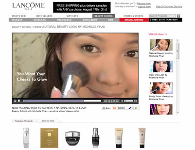
Lancôme—YouTube Beauty Guru Michelle Phan

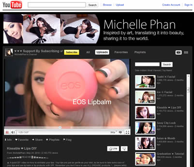
Lancôme was smart to tap Michelle Phan as its video makeup artist in February. The 22-year-old art school student is a YouTube sensation—she’s the most subscribed beauty guru with over 200M views and 800K subscribers.

To keep her inspired, Lancôme sent Michelle to Paris for 4 days, visiting historic sites from Notre Dame to The Pont des Arts where Kate Winslet filmed the signature Trésor commercial, as well as the Lancôme Institute. Her Paris journey is recorded in Lancôme’s Facebook “Michelle + Paris” app.

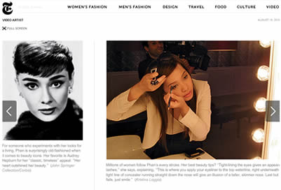
Even though she’s only 6 months into her 2-year contract, her YouTube video views already doubled and she keeps on garnering buzz: This week, she is featured by T, The New York Times Style Magazine, for which she created an exclusive video titled “Futuristic Look.”

p.s.: Did you know she was turned down for a job working behind the counter at a department store for Lancôme? I bet she’s doing OK now.

Bobbi Brown—Pretty Powerful Follow-up

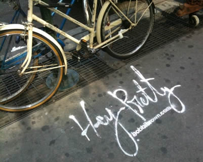
Bobbi Brown captured many in NYC with its Pretty Powerful campaign which was unveiled in May, from print ads to commercials in and on yellow cabs to 5-minute makeovers in their beauty counters. The campaign showcases real women and was kicked off through a video contest in January with public voting in March. For every vote cast in, Bobbi Brown donated $1 to one of Bobbi’s causes, Dress for Success, an organization that provides disadvantaged women with interview suits and career development advice.

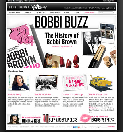
While on my usual browse-mode, I went back to the website and noticed its been jazzed up a little. The Pretty Powerful winners now have a “Get The Look” section on a larger page format. The Beauty Buzz section looks like a news bulletin (albeit one from a very nice design firm) with a strong personal feel, especially in Bobbi ‘s Story.
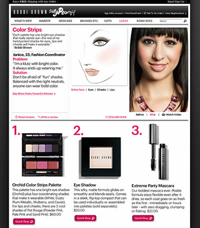
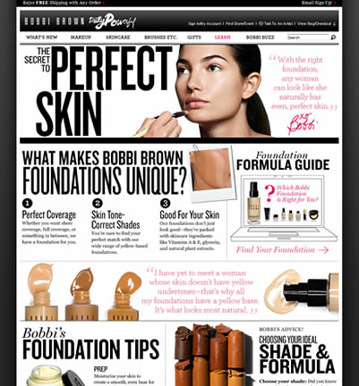
On the other hand, the Learn section has an educational feel of a makeup artist class, where instructions are laid out in a very visual way and the products look almost touchable. The design “Botox” (like they say: You, but better) works for me; I found myself browsing the site more than I usually do.

Maybelline New York—The French Revolution

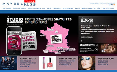
Gemey Maybelline, the French site for Maybelline New York, offers a lot more features I found interesting compared to the US site. On the mobile front, there are Makeup Studio Mobile app, a virtual makeup studio, and Studio Manucure (aka Manicure Studio) iPhone app which shows you the secrets to a perfect manicure, from selecting the right nail polish to nail care solutions.

In addition, there is WeLoveMakeup.com, an online community of more than 20K “Make Up Addicts” sharing thousands of looks and discussion topics. It’s like Facebook for makeup artists and beauty enthusiasts to connect, learn, share, and even have Make Up Parties.

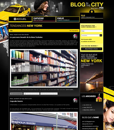
Its Blog in The City features three personalities: Capucine (a makeup addict), Emily (a fashionista) and Flo (for NY looks & trends). The blog is young, fun and informational, the topic ranges from summer frocks ala The Sartorialist to Magnolia Bakery. I even learned that there is such a thing called a trikini. Who knew?

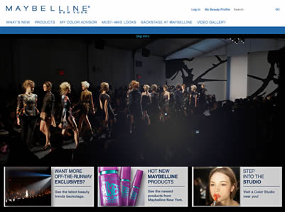
Meanwhile, Maybelline’s US site has the Runway VIP Sweeps and Maybelline Loves Fashion microsite to support Mercedes-Benz Fashion Week in September. You can find videos and instructions on how to get the look, plus a mini NYC guide if you are here in New York during Fashion Week.

The microsite could be a lot better. It’s just not up to par with what you’d expect out of an official sponsor of Fashion Week.

Chanel—Rouge Coco

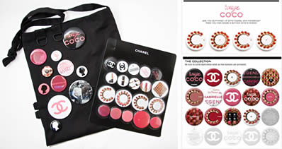
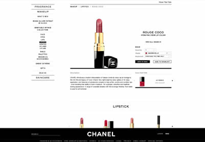
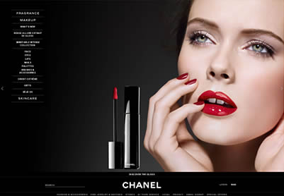
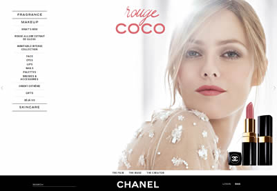
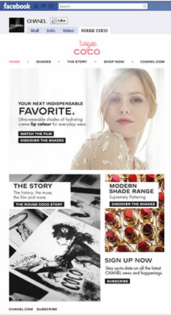
Chanel launched its Rouge Coco campaign this spring, featuring French actress / singer Vanessa Paradis. I like the Facebook effort, where you can share virtual Coco Rouge buttons (a la the press kit / swag bag that was sent out in December) by posting them on your wall. Unfortunately, once the reveal period was over, the buttons are gone.

I like that you can browse all the lipstick shades within the Facebook tab but when you click to “Shop Now”, the color you were reviewing didn’t carry through to the e-commerce site. You can see the color name in the URLstring, but you have to reselect the color from the dropdown.

This is too bad because the e-store interface is nicer than a lot of other beauty brands and because the Chanel site is gorgeous with its simple typography, clean layout and stunning photography.

Related post: Beauty brands online: Summer 2010 #1


Red Pepper Flakes © 2008 - 2011. All rights reserved.

RSS Feed Content by Imelda Suriato