Archived entries for nice work

Fred Perry is one cool cat

Fred Perry Tell us your story

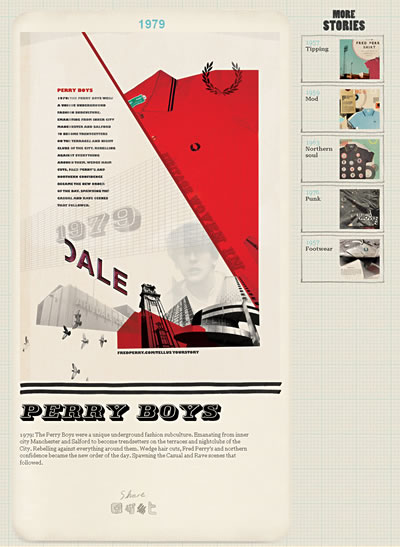
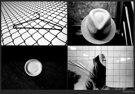
Talk about retro cool. Fred Perry, the tennis-inspired British clothing brand, wants you to tell them your story on Fredperrytellusyourstory.com.

Fred Perry Tell us your story

In this latest campaign, the brand wants to bring the untold stories of the original Fred Perry shirt to life.  I love the graphic treatments, the colors, the cutout styles… everything gives out a very authentic, retro feel. Checkout their old ads.

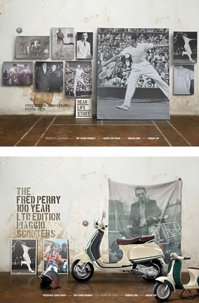
On top of the retro, there is the sleekness of history: Fred Perry – 100 Years.

Fred Perry - 100 years

Yes, it is sleek, yet still very much in line with its retro and heritage spirit. Very authentic indeed and  I like it a lot.
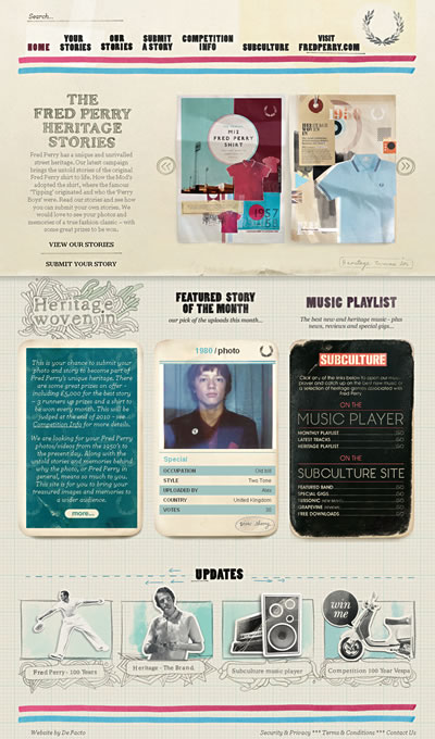
NY, NY, NY, NY by Hiroyuki Ito

NYTimes Lens

Check out “New York, New York, New York, New York” article by Hiroyuki Ito in NYTimes’ Lens Blog. It’s a collection of photo grids (called “Transfer of Guilt”) where each grid contains four snapshots that were taken in New York from 2006 to 2009. They were all shot in black-and-white film, developed and printed on resin-coated paper before being scanned and assembled into grids.

Very street photography, very snapshot, very New York. See the full-screen  slideshow.

Nike Music Shoe

Nike Music Shoe is the latest project by Daito Manabe, Tomoaki Yanagisawa W+K Tokyo and others (4nchor5, rhizomatiks) turning Nike’s free run+ shoe into a music instrument. Created using MaxMSP.

Disclaimer: Shoes sold at retail will NOT make music when bent or twisted. 🙂

Via Creative Applications

“Look, mom… no Flash!” 04.15.10

Beautiful site from Mike Matas who was a designer at Apple. Super simple yet the fact that it’s not Flash made it stunning. Take a look at this video explaining the interface of the new site.

BokicaBo‘s website shows smooth implementation of sliding background and a nice progressive image preloading. Homepage is kinda blah but the slickness of the navigation and detail layover offset any inkling of disappointment I have over some of the design elements.

I really appreciate this Appear site. Super nice preloading, rollover/expand/close toggle, font replacement… A little chugging here and there, but seriously, kudos to the guys at Appear.

PUMA’s Clever Little Bag

First, my favorite sneakers brand Puma ditched their shoe box. It took 21 months, 2000 ideas and 40-plus packaging prototypes to pore over for the perfect replacement: Clever Little Bag,  a new sustainable packaging system for Puma sneakers designed by Yves Béhar and his team at fuseproject. Read more on this clever and earth-friendly initiative plus some estimate stats  on Clever Little Bag’s impact.

Clever Little Bag is part of puma.safe, one of the three programs within the brand’s social and green-themed initiative PUMAVision: Because a better world in PUMA’s vision would be safer, more peaceful, and more creative than the world we know today.

PUMA believes that its position as the creative leader in Sportlifestyle gives it the opportunity and the responsibility to contribute to a better world for the generations to come and I’m glad it’s not just green or benefit/aid channels — puma.creative is to support artist and creative organizations. Check it out.


Red Pepper Flakes © 2008 - 2011. All rights reserved.

RSS Feed Content by Imelda Suriato