Archived entries for just thoughts

Why I Haven’t Been Here Much…

First published in January 2012. Updated on December 2012.

I never thought I’d be one of those “good people” who volunteer every chance they got or build a well in Africa or even buy a Snickers bar from a kid on the subway. Definitely not a do-gooder. But I work hard at every job I’ve had and nobody I’ve worked with ever said I don’t bust my ass every time. When I was asked to produce, I stepped up to the plate and hit. Even with a blog I didn’t mean to create, I stayed late after business hours to write a post every so often because I feel like I have to stick to a schedule (even though I don’t really have a “schedule” schedule). I tried to write a post every week and if I slacked off, it’s every 2 weeks.

So what happened this past six 18 months? Let me start from the beginning.

How this blog got started

When I started this blog, the purpose was to try installing and tinkering with WordPress on a Windows box. (And to show my developers that yes, I still got it!) That’s probably why it is called “Red Pepper Flakes” because I didn’t have much thinking behind it.

As you can see, I didn’t get the URL – some flaky-and-now-defunct cooking site had it. I didn’t bother with a logo – I wanted it to be a bit old school with a touch of web-font-friendliness despite being a “creative” person. Plus, I was sick of making logos for the sake of making logos. I like spicy food and I put red pepper flakes in everything so that kind of worked. I’m also known for my quick witted, sarcastic remarks and oft off-color tones which I fired out of my mouth pretty consistently. So Red Pepper Flakes it is and I started blogging .

I wrote about things I found interesting, from design to technology to art to people. There are no rules (it’s me talking about whatever I feel like talking about), no chest-thumping client work (if it’s something I’m proud of, yes, I will gladly put a disclaimer). I thought it should be educative and enlightening at times – where I share my analysis of certain trends in the industry (I do it at work anyway) and share new trends I find interesting. I also like to share brilliant work from talented people – one of those “I wish I did that/I hate you for being so good” moments – as well as funny amusing things people do.

I started gaining traction with certain group of people – designers mostly, or people who think my Industry Roundup series were useful so they don’t have to do the research themselves. And then I got sidetracked. Hard.

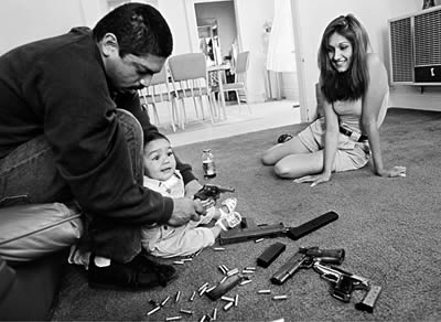
Photo: Emily Zoladz | The Grand Rapids Press

Sidetracked

If you noticed, I started writing a post every 2 weeks, then a month, then longer. Of course as a partner at a small agency, you do more when the economy is this dreadful. RFPs kept coming in, proposals kept going out, meetings kept getting set up and we kept churning out great award-winning work. Clients get smarter – and pickier – and everything just becomes more time-consuming. But that’s not it either (I can always take the hard work and pressure from the job – piece of cake).

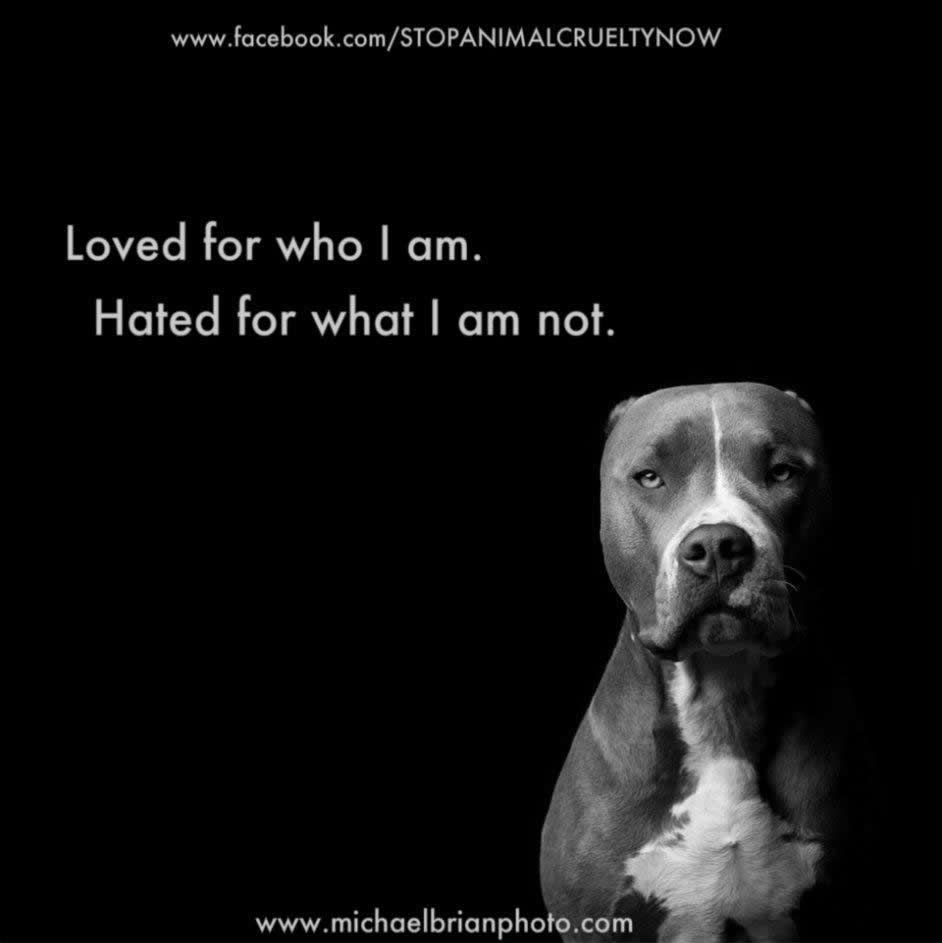
Something happened in July. I went to bed with my mind churning. You might think it’s about the most menial thing but it was about my dog, a rescued pit bull. And I woke up with the idea for “I’m Not a Monster.”

What is I’m Not a Monster? I’m Not A Monster is a place where pet parents of so-called “mean” dog breeds can show how lovely these dogs are and how much they change their pet parents’ lives.

This project started as part of venting my frustration around having a “mean breed” pit bull. Yes, I live with one of those mean, man-eating beasts. Rosco is a rescue. My husband took him off a man who was beating and kicking him in Brooklyn, NY. He was a 10-month old puppy then and was malnourished. We weren’t planning to get a dog but we are dog people and we just can’t let him stay with his previous owner or surrender him to a shelter.

And like I said, I’m not one of those people who volunteer at the shelters. But I spoiled my dog rotten, from feeding him only premium dog food and treats (I’m plugging my client, Wellness Pet Food, here) to letting him take over the couch and bed.

But when family members heard that we got a pit bull, the first reactions were either “you have to get rid of him” or “you have to put him down” accompanied by horror stories of the menacing pit bulls that mauled kids and attacked for no reason. I had a Rottweiler previously (good ol’ Guinness who passed in 2007) and I have gotten the same reaction. People forget that it’s not the breed, it’s the owner. People who breed and train them for protection or fighting are the culprits who made these large, strong breeds the menace of society.

So that’s how I got started. Just as a “cute” idea to shut the idiots up. Before I knew it, it seems to have a life of its own.

The Monster That Occupies My Life

I didn’t think I’d get many stories from people I don’t know. Of course I created a Facebook page and a Twitter account – that’s just something we do when we create a website, right? And I got a couple of stories from people I know (one is a coworker and another a friend’s coworker). So I thought, I should reach out to other pit bull-type dog owner on Facebook. But I didn’t think that people would respond with such enthusiasm.

Before long, I was buried in stories and my Facebook page grew by at least 100 likes a week. What humbled me is the thank you’s I received for every story I published. It’s as if these pet parents (who mostly rescued their dogs from pitiful existence) have been waiting for I’m Not a Monster to come along. But the most eye-opening experience is to learn the horrible facts these “monsters” endured: Dumped, tortured and murdered. Yup. People hate them. The media? They hate them too.

I’ve learned about the overpopulation issue, puppy mills, shelter overcrowding, Breed-Specific Legislation (BSL) to ban pit bull type dogs across the US (well, UK too), tortures, gas chamber mass murders, inhumane heart stick murders, PETA and its lies… The list goes on and on and on… And then I realized I couldn’t just stand on the sideline anymore.

I started using the Facebook page’s reach to educate the public, network animals in need and share rescues needing transports, money, food, media attention…One by one, my nights become hours of story editing, posting news, sharing and networking people to reach out to various shelters across the nation to spare a life.

Yes, a dog’s life.

So I lost sleep night after night for a dog or two. I felt angst going to bed if a dog is not yet taken off the Euthanasia list. I check my Facebook first thing in the morning for updates on these dogs. And yes, I stopped caring so much about which design or trends are cool and worth blogging about. It may be laughable to you, but to me, it’s worth it. And if you’re never on this side, you won’t really get it.

Yup. My life has gone to the dogs!

Meet the first 100 “Monsters” we published in the first 6 months. Watch out. You may fall in love. 🙂

p.s. You may not see me here for a while. I may pop up here and there for air. Or you can drop by I’m Not a Monster. 🙂 As we close the year 2012, we are more than 10,000 strong on Facebook. I also connected with some great people; strong, passionate, determined, kind people. And I thought, wow, this is awesome. To my fellow “Monster” advocates, thank you for being in this journey with me!

Time To Stop Lorem Ipsuming


Lorem Ipsum has consumed our creative juices. It’s time to stop.

_________________________

Lorem Ipsum has been the print industry’s standard dummy text for at least five centuries by some unknown printer. It was popularized in the 1960s with the release of Letraset sheets and, in the last decades, by desktop publishing software like Aldus PageMaker. But I’ve about had it! Designers, Lorem Ipsum makes your brain lazy.

Designers relied on Lorem Ipsum to fill up their beautiful design interfaces. I’ve dealt with design projects where I see designers showing me designs with nice bells & whistles but very little substance. I hired designers based on their portfolio—most coming fresh from great design programmes—which showed great promise of creative ideas and executions. However, a lot of designers fell into the rut of daily designer’s deliverables: They came up with great designs, tackle the creative challenges as far as interfaces go, but fell short in embodying the brand they are designing for.

Some of you may ask “So what?” and here’s my answer:

Words are a great passion of mine. I was one of those designers who think beautiful designs will allow me to express the brand, and until I get the content from the client, FPO will do. And that isn’t just limited to images. It affects copy too. Then I found that the client gave me the copy from their existing website. And it’s crap. So I ended up where I started. That’s when I realized that design has to be jump-started with the right copy.

A lot of web designers in today’s generation do not have the experience of working in the “old school” form of creative environment: Ad firms, where you sit in the room for hours and came up with the right taglines, the right keywords, the right “feel” for the brand. I was lucky to be briefly involved in one where I learned that words are a powerful thing.

Words make you form an idea, a state of mind, a brand. As a starting designer a decade ago, I often came up with fun filler copy to get a chuckle out of the clients, which was a bonus because most of the time it came from my research efforts to understand the client more. Mind you, this was the day before every brand had a website. I found that the research helped me understand the brand better and by writing my take on it, made my design better and my client happy.

With that in mind, as years go by and my responsibility greater, I started writing the copy for website contents to help my designers come up with the right design, starting from the smallest design elements. And it helps.

With a creative brief, my designers see what the client wants after we aligned and realigned their brand presence. However, creative briefs often left a big hole in “What should the website really say?” department. It may be the smallest details, but for the client, every little things matter. And it should.

We, as the creative agency, should be the one responsible for helping the client shape their brand. The right word, the right call to action, the right user experience.

I often sit at my desk, hunkered down, reading lines and lines of the client’s brand documents, doing environmental scan and researching what is said about them. And that helped spark that little spot in my brain that made me go, “Ooh! This is what we should be doing!” And that’s not an image or a color or a page layout. It’s a few words forming the right positioning for the brand. And that makes a heck of a difference. The right positioning makes your client know you’re thinking and breathing their brand, and that you are being their advocate. I’ve had a client who loved a section name we came up with in the first design round. He was so happy he used the word “love.” That’s when you know you got it right.

So go ahead. Write something. Write something great. It’s worth your while.

p.s.: However, if you HAVE to use Lorem Ipsum (sigh…), you can find some options here. Don’t forget to check out Gangsta Lorem Ipsum if it fits your personality better.

Breaking the Spell

Not dissimilar to writer’s block, designers often encounter designer’s block. This is my take on how to beat your way out of it.

_________________________

We’ve all had those moments when you’re presented with a challenge of coming up with a creative concept that will “blow my mind” away. Excellent, you said. This is what I live for.

So you think hard. You look for inspiration, in all the different shapes and places. Your moleskin becomes your battle ground: You sketch. You doodle. You write keywords to emote the brand personality with notes on color palettes, moods and shapes. You start to see your vision. It slowly takes shape, sketch after sketch, honing down to a clear vision in your mind’s eye.

And it’s brilliant! You’re ready to turn this vision into reality: A beautiful design where everyone can see the exquisite typography, color pairing and graphic treatment. For the web, you want to present this fluid and dynamic website where the user experience is simply intuitive and yet so intriguing, the site visitor will spend a lot of time on the site and share it with their network. And your client is going to think you’re god.

Two days later, with the deadline looming over your head, you’re staring at your monitor for what feels like a long time. Wait, what time is it? Oh no. You’ve been looking at the same file for the past hour and you haven’t moved forward an inch.

Yes, you’ve placed the right navigation here, the images are right, the layout looks just like what you’ve sketched out. It’s just something is not gelling correctly. Maybe the image has to get bigger (or smaller?) or moved to the side (or center?) a bit more. Maybe it should be dark blue instead of cerulean (isn’t that turquoise?). And after you fixed that, what happened next? What if the user clicks on the image? How does the site behave then?

Then you realized where you are. You’re stuck. Yes, you’re stuck in the brilliance of your vision and you went in the one direction without every looking back.

It happened more often and to more people than you think. It smacked me in the face when I was in graduate school, 16 hours before my final design project is due, with a term paper yet to be written. And I learned to do a very hard thing: Break the spell.

Here’s how:

Face the music.

Force yourself to wake up from this “fantastic idea” dream and really face the problem. See what’s wrong with the vision. Ask people around you because often times, you’re so close to the project you don’t see the issue. The whole forest for the trees thing.  Have fellow designers or web-savvy friends help you see what’s the snag and reassess your vision. Get input from people in your target audience demographics.

In essence: Step back, take a break, discuss it with someone new. Ideas need to marinate before they can grow into something great. You just have to be patient.1

Maybe it’s just not a good execution of a great vision. Sometime it’s a lack of experience or the design was asking for a different style. As long as you can explain to me how you envision the experience to be, I will then assign it to someone with more experience or better style-match to take the concept and realize it. You should ask your manager if you can get some assistance if that was the case. Trust me, if you’re idea is good, it’ll be worth shuffling resources around to get it done.

Trash it.

On the other hand, if your idea and vision is not right, be ready to scrap the whole thing and start over. Sometimes, it’s easier to start a new concept than to fix something that’s not going to work. This is harder to do because it’s admitting that sometimes, your vision may not be great. Or maybe it’s because you didn’t see 3-steps down the road which, in the digital interactive world, is about 2-clicks ahead.

Of course it’s painful but you get over it because the next design process will be clearer. You may not realize that you took notice of elements that are not working. The clean slate allows you to rethink in a different way how to recapture the initial vision you have.

I have a rule that I impose on myself and designers in my team:

If you don’t get the vision in your head into something I can see in 2 hours, let it go and start over.

I believe in rapid prototyping because it helps you translate your vision quickly to see if it works. I’m responsible for running a business that can’t afford the luxury of time like when you’re in school and the assignments can take days or even weeks to complete. Rapid prototyping lets you articulate your vision in a way that allows everyone else to see it and see where it can go. It doesn’t have to be perfect or even complete. It’s for others—including the agency’s stakeholders—to get the idea. You can do all the finessing and polishing when you know it’s going to work.

Try, try again.

I did say you need to be patient for an idea to evolve into something great. You may say my two-hour rule does not reflect a lot of patience. However, to be able to take something you dearly believe is a great vision and trash it takes patience because you may have to do this again and again. It is good practice, and you need practice to get to a place where you can see the issue before you go down a certain path.

It’s like when you were in design class and your teacher took your work and put red marks all over it. (I have to admit, I was one of those teachers.) It’s frustrating because you thought so hard, worked so hard, and it seems like everything is up for picking. It’s just that we, as teachers, mentors or creative directors, can sometimes better see the issue because we are not so close to it. It is not our vision to baby; It is our job to see the vision realized to the best possible outcome.

And in the end, the client can as easily tell you to scrap it and start over. It happens all the time to everyone in this profession. Even to the best of us.

Trust me, you’ll get used to it. Now go back and give me another take on that.

_________________________

1 Communication Arts: Drawing, Cutting and Pasting

Photo Credit: Overcoming Writer’s Block

Photography & The Digital Age

When iPad arrived and all these apps started popping up, I was really not getting all the hype. It’s just an enlarged iTouch. Right? Then I saw The Guardian‘s iPad app, Eyewitness, and I was blown away by how crisply and smoothly presented the images are. The application brought the message to the medium perfectly and the result is breathtaking: The touchable images are so right there in front of you, they litterally take your breath away.

This little moment brought to mind what the photographer and director Michael Grecco wrote in his blog about “The Crazy Industry” that is photography:

I don’t think we’ve even begun to see the visual changes ahead. I think photography will become this hybrid thing on peoples devices that will incorporate the beauty of the still images in composition, content and feel, but then it will additionally be able to move, inform, and help you act.

With the shrinking of the print world, there will be interesting changes on the way work is presented for photographers and artists alike. Like putting up an online portfolio to showcase your work, magazines are also converting to the digital form.

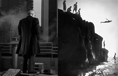
Martin Scorcese, Divers by Michael Grecco

Michael pointed out Issuu.com, a digital publishing platform that can turn your print publication into its digital version that works on the web or even on the iPad by a simple upload. It’s a great way to simplify the presentation layer while creating a database of work by others that allow photographers to see what’s out there and basically “gives me a perspective, not only on myself, but on our society and where we’re heading visually.

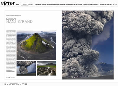
There are other digital publications out there that provides stunning and inspiring photography. Take Victor by Hasselblad and Visura Magazine, beautiful photo glossies.

Victor by Hasselblad: Lanscape by Hans Strand

Visura Magazine: Personal Violence by Joseph Rodriguez

For dailies, here are my favorites:

Dramatic, touching, heart-breaking, uplifting… These images should inspire more than just photographers, but also creative minds to find new ways to experience them.

p.s.: I didn’t include National Geographic because it’s just so obvious, no?

Creativity + Spam = Smiles

Or it could be titled “When Spam Brightens My Day.”

During my usual routine of reviewing comments and deleting Spam from my blog, I found this desperate call for help:

HELP! I’m currently being held prisoner by the Russian mafia xyzrxyz pe[n]is enlargement xyzrxyz and being forced to post spam comments on blogs and forum! If you don’t approve this they will kill me. xyzrxyz pe[n]is enlargement xyzrxyz They’re coming back now. xyzrxyz [company-x] xyzrxyz Please send help! nitip [company-x]

Not very often I found myself laughing over spam email or comments. This Russian Mob Kidnapping spam definitely is a rare case.  The story line, the desperation… Such creativity. Kudos, whoever you are.

p.s. I hid the company name and, of course, the original spam comment does not have any [ ] in it. 😉


Red Pepper Flakes © 2008 - 2011. All rights reserved.

RSS Feed Content by Imelda Suriato