Archived entries for food

Gastrotypographicalassemblage!
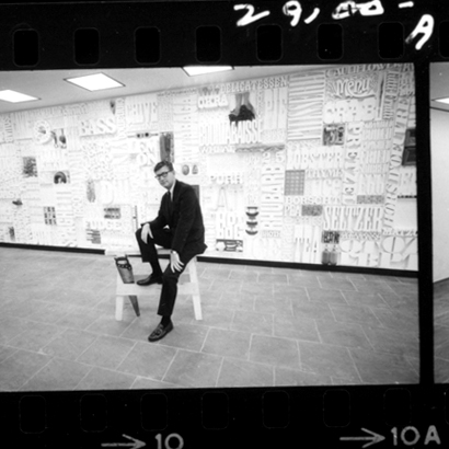
Lou Dorfsman in front of Gastrotypographicalassemblage

When I saw this word, I can’t help but to smile and write about it.

What is it?

Gastrotypographicalassemblage is the name of the 36-feet long, 8-feet high 3D-typographical artwork by American design legend Lou Dorfsman in 1966 for the Eero Saarinen–designed CBS Building’s cafeteria. As an art director for CBS Radio Network (from 1946 to 1987), Dorfsman was responsible for all the building’s graphics, including the hand-milled wood type that listed all the foods and ingredients. In addition, the typography was done by Herb Lubalin and Tom Carnase under his art direction.

How delightful… until it was torn down and tossed aside in the early 90s. If it weren’t for the efforts of designer Nick Fasciano, and ID magazine writer Eve Kahn, it would have been gone for good.

Gallery photo by Christian Carlsson

What brings the word to mind today is an exhibition of Dorfsman’s work under the same title which runs until October 30 at Kemistry Gallery in London. Sixty original print advertising for CBS will be displayed along with the star attraction: The specially-created half-scale, photographic reproduction of Gastrotypographicalassemblage.

Go to Creative Review to read more about the exhibit and the making of it.

For more on the original artwork, its almost demise & restoration:

Also read The Four Lessons of Lou Dorfsman, a tender tribute by Michael Beirut when Dorfsman passed away in October 2008.

_________________________
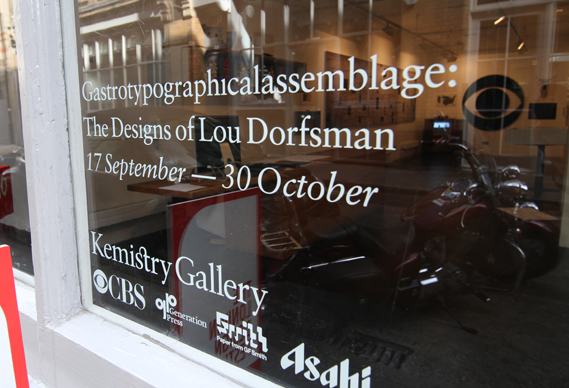
Photo credit: UnderConsideration

Glorious! Soups: Super alphabet soup

Glorious! Soups® packaging caught my eyes when browsing through I Love Dust‘s portfolio. Beautiful illustration and typographic approach sets this packaging apart. Glorious! Soups® takes alphabet soup to another level.

Glorious! Soups®‘s simple black site allows the letters of the alphabet—an ‘A to Z of Global Flavors’—prominently displayed. Iconic, bespoke illustration represents each letter, showcasing authentic global influences and flavors of each product. The illustration is well done (if you know I Love Dust’s work, it’s not surprising at all).

“We wanted to build brand that was bold, adventurous and gutsy to inspire people to try out the new product, ” explains Mandy Taylor, commercial director at Glorious!. Working with Glorious!’s branding agency, Lambie-Nairn, I Love Dust has successfully delivered just that.

The new Glorious! Soups is bold yet eloquent, bringing some ‘zing’ to boring ol’ soups and sauces. It’s simply stunning—both the concept and the design.

How can you not love “M is for ‘Malaysian Chicken'” with delicate Asian flower motif while “T is for ‘Toulouse Sausage and Bean'” and is flanked by legs of can-can dancer?

The Geometry of Pasta

The Geometry of Pasta is not just a recipe book from critically acclaimed chef, Jacob Kenedy. It is a stunning book of over 100 recipes designed in black-and-white that reveals the science, history and philosophy behind spectacular pasta dishes from all over Italy.

It’s designed by award-winning designer, publisher and Creative Partner at Here Design, Caz Hildebrand, who is also responsible for other sumptuous cookbooks by Nigella Lawson and the Hairy Bikers.

The book presents a striking fusion of design and food:  “The book tells you everything you need to know about cooking and eating pasta like an Italian.” The punchy graphic design paired with simple recipes is cheeky, yet efficient. It’s gastronomic pop art, and I want a giant print of the cover as wallpaper in my kitchen!

Visit The Geometry of Pasta for more.

Making sweet real web fonts

Typekit

The days of HTML built-in fonts are now over. Well, sort of.

Typekit, a product of Small Batch Inc. (who is now not so small anymore after their first round of VC funding), is offering beautiful, real fonts for use on the web. This means headline or title graphics don’t have to be created and there really is no need for sIFR anymore.

The best part: The subscription-based service offers Open Type fonts from some of the world’s best type foundries to be used gloriously on the web.

The fee is very minimal, but if you’re a super-starving designer, you can start with their free trial package.

Then comes Google Font API and Directory. No worries, Google isn’t trying to bully Typekit. Both companies openly collaborated to get Typekit Font Events into the open source project WebFont Loader. To boot, Google’s web fonts can be accessed from Typekit so if you’re using both services, there won’t be any compatibility issue.

So it looks like Typekit and Google Fonts are making sweet, sweet real web fonts together. The best part, of course, is the fact that designers will now be able to explore web font usage without having to worry about production, search engine-friendliness, Mac vs. PC font fibs, and the need to buy every single font you want to use for comps.

Yes, I’ve been there, knee-deep in “beg, borrow, steal” font territory. Can you smell the freedom now?

Greenmarkets NYC

What is Fresh lists all the local food and farmers markets in New York City. On top of showing the days when the Greenmarkets are open and where, it also provides you with what is available in which locations.

My fave has to be the Union Square one for the number of vendors and variety. Favorite greenmarket snack: Raspberry nut bar from the one in Bowling Green. Yumm!!


Red Pepper Flakes © 2008 - 2011. All rights reserved.

RSS Feed Content by Imelda Suriato