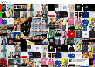

The RootxDouglasCoupland clothing line, a collaboration between Douglas Coupland (the author of the bestseller Generation X) and Roots (the Canadian clothing company), finally unveiled in stores yesterday.
I heard about this collaboration through the grapevine a.k.a Twitter and I straightaway thought, oh no, what’s a literary doing with a clothing brand? But then I remembered that he’s also an artist, screenplay writer and producer. His ability to capture our techno-pop-culture extends to his art, where he explores and corrupts dimensions of pop culture and pop art. Andy Warhol’s his favorite study.

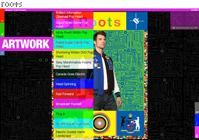
The collaboration with Roots features not just clothing, but art installations, sculpture, custom designed art and retail spaces. The RootxDouglasCoupland website is projects Coupland’s aesthetic very strongly –TV test pattern, pixilated objects and punch-card dots to name a few. The warping mouse-over effect that is suspiciously very Yugo Nakamura (remember his Wonderwall?).

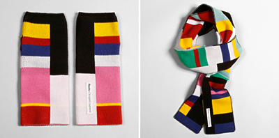
To be honest, the pieces are fantastic. Look at these Test Pattern Armwarmers! That’s going into my closet.

When interviewed by Steven Heller, Coupland explained that his Roots clothing line as more of an art/design experiment, part of his exploring new ways of perceiving “being Canadian.” A friend suggested he collaborated with Roots as part of that exploration and he thought “it was a good idea, and wonderfully free of cynicism.”
Coupland also loves Penguin (the Canadian publishing house, not the bird) for their cutting edge worthiness and dutiful minimalism. He’s speaking about the covers and he’s not just saying. For Penguin’s 75th Anniversary in March, he created Speaking of The Past, celebrating the publishing house with invitation for fans to design their own Penguin covers as well as showcasing the various original templates used from 1935-1963.

His devotion to their simplistic design lines was strongly expressed in this little autobiographical paragraph:
Last month I installed new bookshelves in a room in my house. They’re black, and my painter offered the unsolicited opinion that they might look depressing when completed. I knew he was wrong because, at the very least, the paperback shelf couldn’t help but have a cheerful orange zing a zing that comes from the Penguin spine, the most wonderfully insidious default interior design statement in our culture. Even crack dens glow with Penguins on the shelf.
That, in my opinion, is lovely. What a statement of devotion.
You have to admit, Douglas Coupland is one hell of a creative and productive human being. How inspiring.
