Archived entries for cool stuff

Photography & The Digital Age

When iPad arrived and all these apps started popping up, I was really not getting all the hype. It’s just an enlarged iTouch. Right? Then I saw The Guardian‘s iPad app, Eyewitness, and I was blown away by how crisply and smoothly presented the images are. The application brought the message to the medium perfectly and the result is breathtaking: The touchable images are so right there in front of you, they litterally take your breath away.

This little moment brought to mind what the photographer and director Michael Grecco wrote in his blog about “The Crazy Industry” that is photography:

I don’t think we’ve even begun to see the visual changes ahead. I think photography will become this hybrid thing on peoples devices that will incorporate the beauty of the still images in composition, content and feel, but then it will additionally be able to move, inform, and help you act.

With the shrinking of the print world, there will be interesting changes on the way work is presented for photographers and artists alike. Like putting up an online portfolio to showcase your work, magazines are also converting to the digital form.

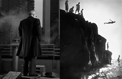
Martin Scorcese, Divers by Michael Grecco

Michael pointed out Issuu.com, a digital publishing platform that can turn your print publication into its digital version that works on the web or even on the iPad by a simple upload. It’s a great way to simplify the presentation layer while creating a database of work by others that allow photographers to see what’s out there and basically “gives me a perspective, not only on myself, but on our society and where we’re heading visually.

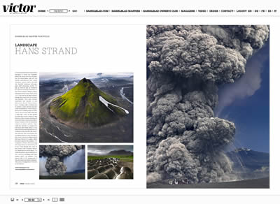
There are other digital publications out there that provides stunning and inspiring photography. Take Victor by Hasselblad and Visura Magazine, beautiful photo glossies.

Victor by Hasselblad: Lanscape by Hans Strand

Visura Magazine: Personal Violence by Joseph Rodriguez

For dailies, here are my favorites:

Dramatic, touching, heart-breaking, uplifting… These images should inspire more than just photographers, but also creative minds to find new ways to experience them.

p.s.: I didn’t include National Geographic because it’s just so obvious, no?
Photoshoplooters

Designers having fun with Photoshop @ rioters.

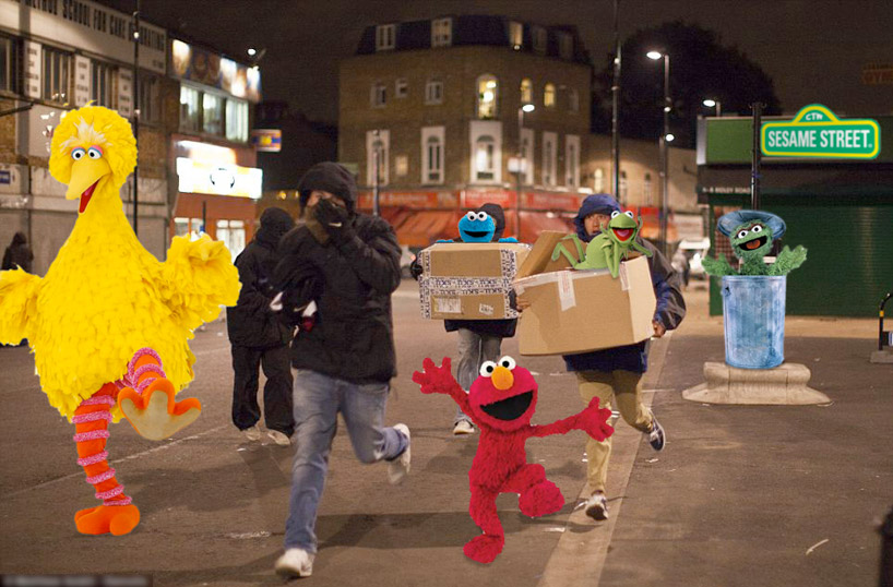
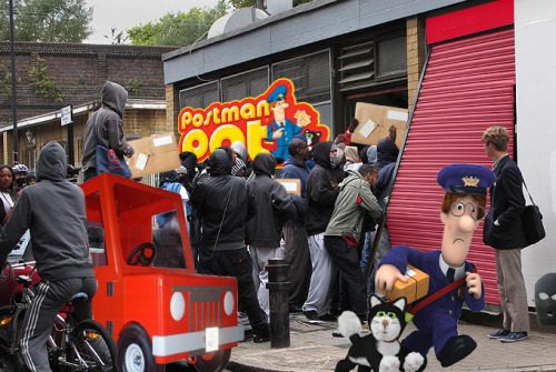
Are these the results of designers fighting back? Check out this tongue-in-cheek response to the ongoing riots happening in london. Photoshoplooter is a collective blog that features images of looters stealing a variety of absurd items.

Images from the media are edited using Photoshop to illustrate civilians looting various out-of-place beloved characters: Sesame Street, Godzilla, oversized stuffed animals, a team of pandas and even playing a game of twister.

Absurd? Absolutely! But highlighting the absurdity of the act and event makes this blog a highly relevant reply to the current cultural climate of the city. So if you were one of the rioters, looters and other hooded marauders, watch out. You may find yourself hugging Spongebob.

To join in, send embarrassing loot to photoshoplooter@gmail.com. For more, go to Photoshoplooters.

Reblogged from Design Taxi

Lovely Surprise

Received a lovely surprise today from Michael Ash Partners: Two lovely signed prints, a deep blue-on-blue flower from Tokyo-born Kenji Aoki’s Color Collection and a leaping body from Singaporean Cheng Joo.

Beautiful pieces I cannot wait to frame white-on-white. They’re going to look gorgeous somewhere in my place. Thanks, Michael!

QR Codes + Graffiti > Commerce

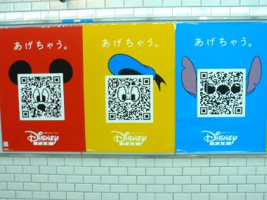
Everybody is talking about Calvin Klein’s “Get It Uncensored” QR Code billboard in SoHo. So what. It’s been around in Japan for ages (well, maybe not ages, but since the 90’s). Invented by Denso-Wave in 1994,  it’s now pretty much on every printable/projectable surface.

The US market is finally catching on and we started seeing commercial uses such as the Calvin Klein billboard or the Nordstrom storefront, or as tourism tool being utilized by European cities like Bordeaux, France, with its Digital City Project or Senigallia on Italy’s Adriatic coast with its QRCity. And yeah, it’s the next biggest thing and its cool. But it has to be more than commerce or tourism.

Then came the Berlin-based urban artist Sweza. Since graffiti are always removed by either the local authorities or property owners, he decided to photograph the graffiti to preserve it and after the graffiti was removed, he placed a QR code in the exact location, which shows you the original. It’s QR code acting as graffiti, but cleaner. Very clever.

Taking that a step further, Digit, a London-based interactive communications agency, is QR-Coding graffiti and making it a talking point. Called I Could Do That, the project basically stems from how everyone always has an opinion about different urban art. A QR code is placed next to each graffiti/art piece which brings you to a site where you can post your comment or read other people’s. So now the graffiti becomes an invitation to a dialogue, creating a reciprocity of some sort.

See samples of comments on Vhils piece above.

For me, it allows the city dwellers/walkers to have a kinship with the concrete you walk on and the walls you pass through. It is “if this walls could talk” times ten. And I like that.

End notes: Thanks to 2d code for being such a resource for all things QR code. What’s the future? I see on-the-spot public voting (from policies to ideas) and online-offline dialogue (think conferences or soapbox orations a la Hyde Park) to QR code as bouncers (yup, you’re not on the list, buddy!). It’s going to be a lot of fun.

If you have any interesting ideas on QR code application, let me know.

The Geometry of Pasta

The Geometry of Pasta is not just a recipe book from critically acclaimed chef, Jacob Kenedy. It is a stunning book of over 100 recipes designed in black-and-white that reveals the science, history and philosophy behind spectacular pasta dishes from all over Italy.

It’s designed by award-winning designer, publisher and Creative Partner at Here Design, Caz Hildebrand, who is also responsible for other sumptuous cookbooks by Nigella Lawson and the Hairy Bikers.

The book presents a striking fusion of design and food:  “The book tells you everything you need to know about cooking and eating pasta like an Italian.” The punchy graphic design paired with simple recipes is cheeky, yet efficient. It’s gastronomic pop art, and I want a giant print of the cover as wallpaper in my kitchen!

Visit The Geometry of Pasta for more.


Red Pepper Flakes © 2008 - 2011. All rights reserved.

RSS Feed Content by Imelda Suriato