Archived entries for cool stuff

Before & After: Jogging Series

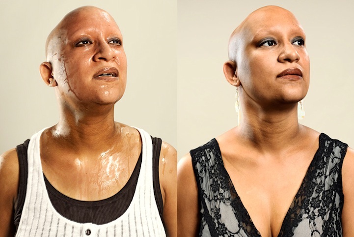
Would you let people take a picture of you after you just finished your jog, out of breath, sweaty and disheveled? French photographer Sacha Goldberger asked random joggers to do exactly that and here’s the results.

_________________________

Sacha Goldberger loves coming up with interesting projects (check out his fantastic “Mamika” series, featuring his 91-year-old Hungarian grandmother Frederika as a superhero). So last summer, he decided to start another interesting project. He created an outdoor studio at Bois de Boulogne, a park near Paris that’s 2 1/2 times the size of New York’s Central Park, where he stopped joggers and asked them for a favor: Would they sprint for him and then pose right after for his camera?

Surprisingly, many obliged. Out of breath, sweaty, disheveled, these joggers let him snap away. He then asked these same people to come into his professional studio exactly one week later and using the same light, he took their pictures again in the same pose they had before.

As you can see, the difference is remarkable. The before and after comparison showed such visible signs of fatigue on the subjects’ faces after the sprint.

This is what Goldberger wants to show with the series:

“I wanted to show the difference between our natural and brute side versus how we represent ourselves to society. The difference was very surprising.”


How true. That’s why I prefer photo shoots in the morning hours. Trust me, it’s not the lighting. You just look better because the day hasn’t worn you out yet. So seriously, don’t let people take your pictures after you ran around the block unless you have a team of stylist & makeup artist to take that “yikes” out of your face. 🙂

I know Goldberger will continue finding  interesting ideas and formulating them into more interesting projects. Don’t forget to check out his “Mamika” series:

Grandma’s adorable, isn’t she? BTW, because of this photo series, grandma’s gone viral!

See more of Sacha’s Goldberger’s work & projects, visit sachabada.com

_________________________

Via My Modern Met. Photo credit: Sacha Goldberger

Ben Long: Dirty Art

An on-going series by Ben Long, The Great Travelling Art Exhibition is not your typical scrawled words (very often adolescent obscenity) etched into the dirt built-up from exhaust emission. The elaborate drawings on the rear shutters of long-haul trucks are eye-opening.

The temporal quality of the project is also its draw, as he explained:

“Lasting a finite period, though sometimes as long as six months, it is precisely this impermanence and vulnerability that give the drawings their point of interest and contemporary relevance.”

It’s a genius stroke against something as mundane as a dirty truck, elevating it into a piece of traveling art. It turns the freight vehicle as a moving canvas beyond the confines of the traditional gallery space.

See more of The Great Travelling Art Exhibition, visit www.benlong.co.uk

Book Lovers Locked in NY Public Library

Ever wonder what it would be like to spend 10 hours locked in the Library with 500 other people?

You can with “Find the Future: The Game“—a pioneering, augmented reality experience created especially for New York Public Library’s Centennial by famed game designer Jane McGonigal, with Natron Baxter and Playmatics.

The interactive game combines real-world missions with virtual clues and online collaboration, and is “designed to empower people to find their own futures by bringing them face-to-face with the writings and objects of people who made an extraordinary difference,” says McGonigal.

All 500 participants, locked overnight in the Library, explored the building’s 70 miles of stacks, and, using laptops and smartphones, following clues inspired by 100 works from the amazing collections of NYPL, to such treasures as the Library’s copy of the Declaration of Independence in Thomas Jefferson’s hand. After finding each object, each player wrote a short personal essay inspired by his/her quest. Winning the game meant writing a collaborative book based on these personal stories about the future, and this volume will be added to the Library’s collections.

Yes, it sounds nerdy. Yes, it’s like A Night at the Museum but for bookworms with inch-thick glasses. Douglas MacKrell, one of the participants, made this video that really captures the movement and energy of what it was like to spend 10 hours locked in the Library and on a quest with 500 people.

I think it’s dope. (Yes, I was one of those bookworm nerds with glasses perching on the library all day long. I ♥ books!)

Moleskine World: Notebooks & Beyond

During Milan Design Week, Moleskine unveiled its Travelling collection: Versatile bags and cases with various add-ons that can be tacked on to the insides of your bag or detached so you can easily transfer it to another bag. And just like its notebooks, everything carries the brand’s signature look, from the simple design, black color and rounded corners, to the elastic closure and the “In case of loss” label inside.

Moleskine Bags in Hyper Stop Motion

What really caught my attention is the cool video, with its hyper stop motion illustrating the conception of the collection. Done by Rogier Wieland, the video offers “a close view into the new Moleskine bags and their design process. Freehand technical drawings, sketches and photographs all morph and merge together into each other.”1

It portrays how Moleskine adventure continues beyond paper, which during the Milan Design Week seems to really transcend its traditional medium with Scriba , an installation by Giulio Iacchetti , and the Magic Box interactive demo from Zetalab.com to celebrate its new Writing, Travelling and Reading collection.

Moleskin Magic Box @ Fuorisalone 2011 by Zetalab

Taking a look at all these new installations and products, one must admit that Moleskine as a brand knows how to expand, extend, crossover between analog and digital without forgetting its core. Moleskine® is a brand that encompasses a family of nomadic objects dedicated to our mobile identity: flexible and brilliantly simple tools for use both in everyday and extraordinary circumstances, ultimately becoming an integral part of our personality.2

And in true Moleskine fashion of “oh, we have a notebook for that,” the Moleskine Passions collection was created in 2010—a series of notebooks dedicated to the passions of life, from Recipes, Wine, Travel, Books, Film and Music, to Wellness, Gardening, Baby, and yes, even Dog and Cat.

I encourage you to explore Moleskine’s videos, including the Moleskine Passion series (they make me want to buy them all!), because they are imaginative, passionate, creative and fun. And it sends a clear message:

Moleskine is no longer the notebook from the days of yore, used by artists and thinkers such as Van Gogh, Picasso and Hemingway over the past two century. These notebooks have become a symbol of latter-day nomadism, and with these recent crossover interactive efforts, Moleskine ensures it is intimately tied to the digital world.

_________________________

1Moleskine® — The Official Channel: Moleskine Bags in Hyper Stop Motion

2Moleskine World: Culture, imagination, memory, travel, personal identity

Photo credit: Moleskine®

Cinemagraph: Fashionable animated .gif

We can call it the rebirth of animated .gif because it’s never been so fashionable. Yes, kids. These are not your mother’s animated .gifs. These are animated .gifs with stiletto heels that make your head turn.

_________________________

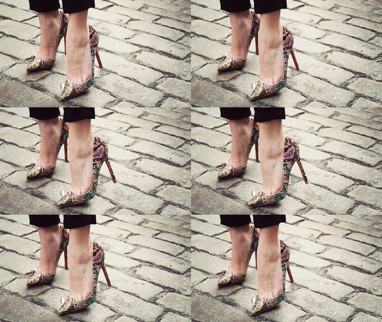
Cinemagraph #1: A Louboutin crushing a cigarette


When I first ran into a cinemagraph and realized it is basically a very refined animated .gif, I was thoroughly impressed. Jamie Beck, a NY-based photographer, and her fiance, Kevin Burg, have been making sweet images using this “cinemagraph” technique on her blog, From Me To You, and getting people to notice them.

By combining still photography and video to finely animate the image, the results are stunning; the still photography seems to unfreeze in front of your eyes. Sometimes the effect is a nice little peek-a-boo that makes you do a double-take and notice.

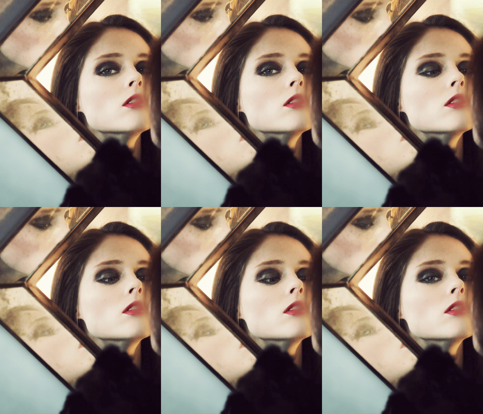
Cinemagraph #2: Coco Rocha – Here’s Looking At You


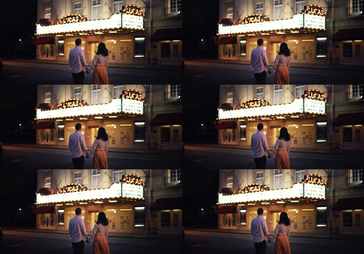
The Coco Rocha shot reminds me of the head-turning (literally!) Burberry Eyewear, with that little jolt of surprise. The date night shot below reminds me of the DKNY Uncoverthecity.com we created in in 2007, where the New York cityscape became the focus instead of the backdrop and the city came alive with the infusion of ambient animation.

Cinemagraph #3: Date Night – Jamie & Kevin


It’s that special little something that makes you really notice. And here’s that word again: Notice. We—designers, photographers, artists—continuously look for ways to make something that people will notice. We use bold splashes of colors, big typography, quiet minimalism, fluid motion, 3-dimensional spatial movements…All to make the audience take notice and stop (to admire, to reflect, to feel what you want them to feel), and maybe stay and come back for more.

What I love about Jamie’s cinemagraph is its simplicity. Jamie describes it as “a traditional still photograph with a moment living within it.”1

Of course it doesn’t hurt that Jamie’s photography is just stunning. (Yes, Jamie,  you make me wish I have your Hasselblad!) Love that she still uses film; it’s so old-school good, you can visually feel the film grains.

More importantly, the duo realize that not everything can be made into cinemagraphs—just because you find a way to “cinemagraph” it. This is their rule of thumb:

“A cinemagraph always starts with a photograph. As a rule of thumb, we only create a cinemagraph from subject matter that would also make a good still photo.”

Plus, it can take several hours of manual editing2 to create each image with a level of sophistication that they have. Just because you can paint a Picasso, doesn’t mean you can paint like Picasso…or something like that. Yes?

The recent resurgence of the animated .gif has made some people notice (see my post “Fun Retro Web” in March 2010 on I’m Not An Artist animated .gif galore) and I’m glad some very talented people have taken it further and in a style better than I’ve ever put much thought into. Hats off to you, animated-gif-agitators!

Who knew you’d ever look at an animated .gif and see the potential, and yet here we are.

_________________________

1Turnstyle News: So Long Animated GIFs, Hello Cinemagraph

2The Atlantic: How Jamie Beck and Kevin Burg Create Their Animated GIFs. There are a few tutorials by others attempting to decode and recreate (see ‘s how-to) but none produces the results like hers—Jamie just did a superfine job and at, what I would guess, a really high framerate to give her cinemagraphs that ethereal quality.

Photo credit: Jamie Beck

So Long Animated GIFs, Hello Cinemagraph


Red Pepper Flakes © 2008 - 2011. All rights reserved.

RSS Feed Content by Imelda Suriato