Archived entries for cool sites

“Look, mom… no Flash!” 04.15.10

Beautiful site from Mike Matas who was a designer at Apple. Super simple yet the fact that it’s not Flash made it stunning. Take a look at this video explaining the interface of the new site.

BokicaBo‘s website shows smooth implementation of sliding background and a nice progressive image preloading. Homepage is kinda blah but the slickness of the navigation and detail layover offset any inkling of disappointment I have over some of the design elements.

I really appreciate this Appear site. Super nice preloading, rollover/expand/close toggle, font replacement… A little chugging here and there, but seriously, kudos to the guys at Appear.

Fun Retro Web

Check out this animated gif galore at I’m Not An Artist. I remember the days I had to make many animated gifs.

It was back in 1999 and they’re these teeny-tiny animated-gif stamps for Eastern Mountain Sports’ e-card campaign. These mini banner ads are to be placed on the corner of  send-to-friend email templates and I had to actually come up with banner concepts and copy. Oh, and there’s one for every sports they cater to: snow-shoeing, mountain-climbing, skiing, kayaking… The list didn’t seem to end. I was really sick of animated gifs after that.

On the other hand, Love Creative site is a throwback to Powerpoint 97. Remember those cool wipe-out or dissolve transitions that used to make you go “ooohhh!” because you thought those are dope? They have all of them. Very retro indeed.

Stylish Sony Style

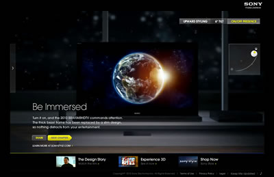
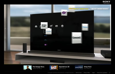
Sony Style’s Bravia microsite has brought back drooling over TV. The site takes  a little long to load but the interface is delicious. Mostly videos, the site showcases the new TV’s ability to tilt 6-degrees back for better viewing, connect to the internet and the social media sphere, etc.  and it’s visually stunning.

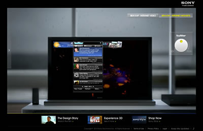
I love the control tool: a little flat scroll-wheel-turn-slider-turn-control-button that makes dragging your mouse for control feels very smooth. It’s hard to describe because it feels preciously like you’re actually using your fingertip. Maybe it’s just Friday and I’m having Campari and soda in the office. 🙂

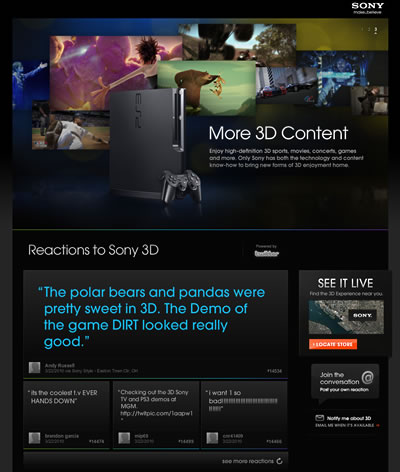
Then there’s the 3D TV. I like the little Flash Twitter post display.

Now we just have to wait for TV signal from cable to catch up.

The not so Lonely Planet


Lonely Planet on mobile, TV, touch, web, social…

First, we start with the Lonely Planet mobile apps offering Guide Books and the audio Phrasebook, offering travellers help in multitude of languages, from Arabic to Swahili.

Then there’s LonelyPlanet.TV that produces and develops some of the best travel and factual programming, including its flagship series, Lonely Planet Six Degrees. This playful, sassy, streetsmart and unexpected show that connects viewers to what makes each city special – the people that live in it.

To match that spirit, One Planet. 100 million stories invites you to share your travel photos and win a round-the-world trip for two. Pretty cool interface once you get to the photos but it is a little slow. Another is a Twitter contest that harnesses the lightheartedness  and the social nature of Lonely Planet audience.

And in a true Lonely Planet traveler spirit, they developed the BlogSherpa where bloggers can blog about destinations and in return, get traffic and paid in return via Google Adsense.

The latest addition is Lonely Planet on Microsoft Surface prototype developed by Amnesia Razorfish to go into Lonely Planet stores. The app allows shoppers to place a guide book on the table and interact with content from that book, along with additional video content. You can then take a Lonely Planet passport book from the front counter, place it on the table, and then drag content from the books onto the passport, which you can retrieve later on the website.

This iconice brand seems to be doing stuff right. It stays true to the founders‘ attitude. Very cool.

Keds gets cool

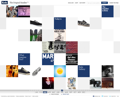
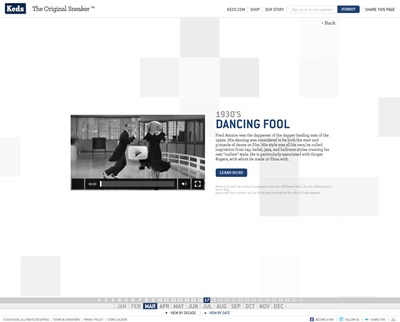
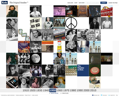
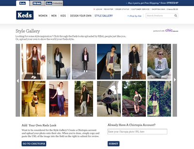
Who knew Keds is for the cool kids now? The Original Sneaker by Keds is a totally cool interactive time travel with story of the day teamed with Daily & Decade Facts and links to style gallery and other features. You can also quicky tweet your inspiration. The Flash interface is clean and simple to navigate with nice panel-flipping transition.

The Style Gallery is powered by Chictopia.com, a fashion community housing style gallery, personal fashion blogs, contest, etc. Just put the URL of your photos and you’re in. Chictopia.com also lets you shop, find sales and shopping deals, and connect with other stylista. And the more you interact with the site (post in forum, comments on photos, upload your own photos), the more “chic rewards” you get, opening more site features as your accumulate points.

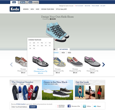
Another feature of the Keds site is Design Your Own Keds Shoes.  Powered by Zazzle, it lets your channel your inner artist and create your custom Keds. You can start from scratch or use others as inspiration.

Very cool, Keds. And I thought Keds shoes are something you have to be forced to wear! 🙂 What do I know!


Red Pepper Flakes © 2008 - 2011. All rights reserved.

RSS Feed Content by Imelda Suriato