Better Views For My Social “News”
Breaking the layout “gray area” in online news streams world.
_________________________
In graphic design classes, you are taught to be friends with the white space, ensure your design has clear entry points, and—my personal favorite—break the gray area. Yes, this is from print design classes I took circa 1995 since interactive design (aka “multimedia”) had yet become a field of study.
Your challenge is a white spread of paper, figuratively and literally, and you have to put all that content in there. Usually that means flowing copy in odd-numbered columns (or now you kids call it “grids”) to create a visually appealing layout. All that crammed up copy becomes “gray areas” and your eyes don’t want to stay on them. It creates what’s called “reading fatigue”—you don’t want to read a long article on The New York Times unless you’re really into it—and that’s why god created focal points, white space and pagination to fight gray areas.
The gray area challenge stays true today with most social media interfaces like Facebook and Twitter. What also is true is the fact that web users don’t read, or more accurately, don’t read most of the copy in front of them. They skim the content, waiting for some words or visuals to grab them.
That’s why content visualization is key in my book. The good kind, of course, and here are some products out there that makes my eyes happy and my visual browsing experience better:
PostPost
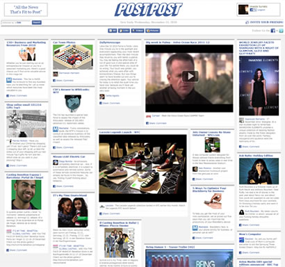
PostPost offers an alternate content visualization method for your Facebook. It takes your Facebook news feeds, i.e. links your friends and Pages shared, and lays them out as stories in a newspaper-like display. The design feels familiar—yup, it’s very much like the current trend of displaying feeds in boxes with large image or video and some copy blurb (e.g. The Huffington Post or Times Skimmer from The New York Times, below).
Each “news” bucket is more user-friendly and social-friendly: You can delete news you don’t want via the standard “X” button, videos play in-line and, as quickly, share / like / comment on it. The interface is simple and the user experience is conducive to the ever-impatient social media consumption.
PostPost creator, Peter Yared, sees it as the natural evolution of content consumption. “Instead of displaying what an algorithm on Google, strangers on Digg, or an editor on The Huffington Post surface, we show what your friends think is interesting.”1 And hopefully triggers social conversations between friends.
And back to the point of this post, it is definitely a better layout, nice visuals acting as clear entry points broken by enough “white space” to actively engage your eyes.
For a look into PostPost, its features, technology and future, read Inside Facebook‘s review.
Paper.li
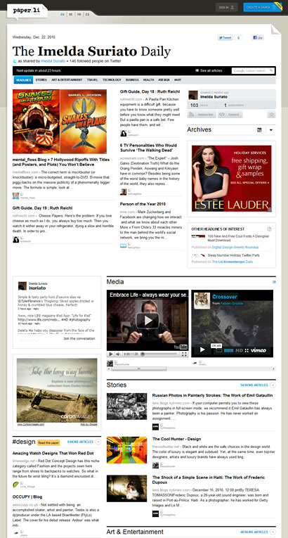
Paper.li is a news aggregation service for your Twitter. It visualizes the feeds from either the people you follow on Twitter, a Twitter search, or a Twitter list and puts them together like a newspaper. The interface is straight-forward and clean.
Unlike PostPost which requires you to log into your Facebook account to pull your feed, you don’t have to create an account to use Paper.li if you want to read other-created papers. You can search available papers by name, categories, interests and more. Checkout Netflix’s Paper.li using hashtag: http://paper.li/tag/netflix
I like the novelty of it and I appreciate any content visualization method created to improve content absorption. Yes, they can improve the refresh rate, which is limited to daily update instead of PostPost’s real-time update. Yes, there are things to improve upon (read Jason Keath’s hate letter) and yes, there are a lot of nice things that can potentially make Twitter news stream visualization better (read Boost All’s love letter)
For a thorough review of Paper.li, read PC Magazine‘s write-up.
It definitely beats reading rows and rows of 140-character tweets without any discerning way to distinguish content. Looking at the Twitter avatar doesn’t help me in figuring out what the tweet is about.
Times Skimmer
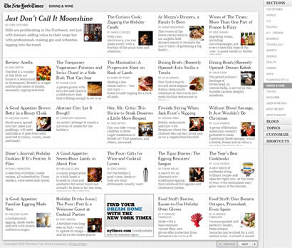
Before the iPadization of web design, The New York Times came out with Times Skimmer in February. This browser-based application offers online readers a new way to read paper. The interface now looks very familiar, with the fluidity of spreading out the content according to your browser window size just like spreading a newspaper as well as paging through it.
Clean, simple and to-the-point, it’s a better way to “skim” the news. Apparently, it is a precursor to the Times’ Chrome app, which became available two weeks ago.
If all these skimming techniques work well, who knew? We may not even want to read the real paper anymore.

We’ll have to look up Google images to find a screenshot of the Times’ paper and say, “Remember this?” to the future generation.
For more on the Times Skimmer:
- NY Times’ own walk-through
- Media Nation‘s review
Conclusion:
In the age of curated consumption, does what your friends know make it valuable? That’s for you to decide. This Facebook vs. Twitter 2010 stats from ZDnet may help you.
I have to admit, these are some starting points to better content visualization for your news feed. Some may call them curated content although I consider them simply as news aggregators. What I like most about PostPost is its real-time updates, which is the main complaint people have on other visual news aggregators such as Paper.li and iPad’s Flipboard.
Well, you have to start somewhere, right? And I like the way this is going for the sake of better design and better user experience.
_________________________
1Inside Facebook: PostPost Turns Facebook Links into a Socially Curated Custom Newspaper
Photo credit for old newspapers: ShironekoEuro


[…] This post was mentioned on Twitter by ronanmccoy. ronanmccoy said: RT @isuriato: My thoughts: Better View For My Social "News" http://bit.ly/gICJVv Notes on content visualization, #PostPost, #paperli & # … […]