Beauty brands online: Summer 2010 #2
Lancôme—YouTube Beauty Guru Michelle Phan
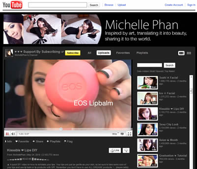
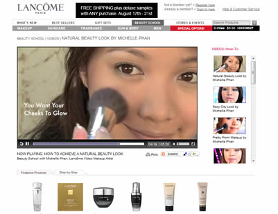
Lancôme was smart to tap Michelle Phan as its video makeup artist in February. The 22-year-old art school student is a YouTube sensation—she’s the most subscribed beauty guru with over 200M views and 800K subscribers.
To keep her inspired, Lancôme sent Michelle to Paris for 4 days, visiting historic sites from Notre Dame to The Pont des Arts where Kate Winslet filmed the signature Trésor commercial, as well as the Lancôme Institute. Her Paris journey is recorded in Lancôme’s Facebook “Michelle + Paris” app.
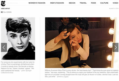
Even though she’s only 6 months into her 2-year contract, her YouTube video views already doubled and she keeps on garnering buzz: This week, she is featured by T, The New York Times Style Magazine, for which she created an exclusive video titled “Futuristic Look.”
p.s.: Did you know she was turned down for a job working behind the counter at a department store for Lancôme? I bet she’s doing OK now.
Bobbi Brown—Pretty Powerful Follow-up
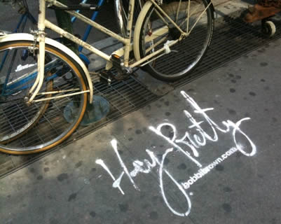
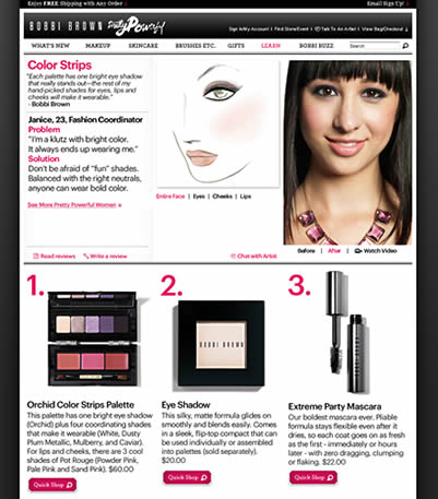
Bobbi Brown captured many in NYC with its Pretty Powerful campaign which was unveiled in May, from print ads to commercials in and on yellow cabs to 5-minute makeovers in their beauty counters. The campaign showcases real women and was kicked off through a video contest in January with public voting in March. For every vote cast in, Bobbi Brown donated $1 to one of Bobbi’s causes, Dress for Success, an organization that provides disadvantaged women with interview suits and career development advice.
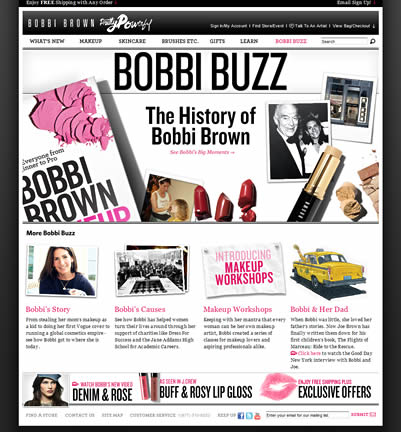
While on my usual browse-mode, I went back to the website and noticed its been jazzed up a little. The Pretty Powerful winners now have a “Get The Look” section on a larger page format. The Beauty Buzz section looks like a news bulletin (albeit one from a very nice design firm) with a strong personal feel, especially in Bobbi ‘s Story.
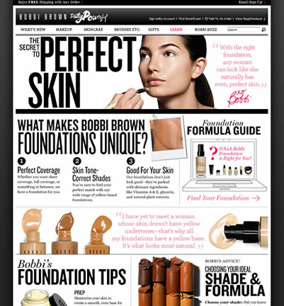
On the other hand, the Learn section has an educational feel of a makeup artist class, where instructions are laid out in a very visual way and the products look almost touchable. The design “Botox” (like they say: You, but better) works for me; I found myself browsing the site more than I usually do.
Maybelline New York—The French Revolution
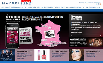
Gemey Maybelline, the French site for Maybelline New York, offers a lot more features I found interesting compared to the US site. On the mobile front, there are Makeup Studio Mobile app, a virtual makeup studio, and Studio Manucure (aka Manicure Studio) iPhone app which shows you the secrets to a perfect manicure, from selecting the right nail polish to nail care solutions.
In addition, there is WeLoveMakeup.com, an online community of more than 20K “Make Up Addicts” sharing thousands of looks and discussion topics. It’s like Facebook for makeup artists and beauty enthusiasts to connect, learn, share, and even have Make Up Parties.
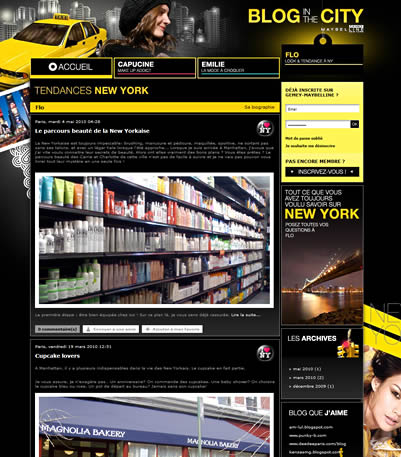
Its Blog in The City features three personalities: Capucine (a makeup addict), Emily (a fashionista) and Flo (for NY looks & trends). The blog is young, fun and informational, the topic ranges from summer frocks ala The Sartorialist to Magnolia Bakery. I even learned that there is such a thing called a trikini. Who knew?
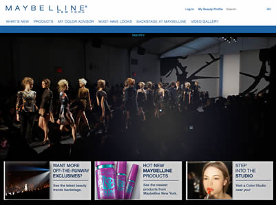
Meanwhile, Maybelline’s US site has the Runway VIP Sweeps and Maybelline Loves Fashion microsite to support Mercedes-Benz Fashion Week in September. You can find videos and instructions on how to get the look, plus a mini NYC guide if you are here in New York during Fashion Week.
The microsite could be a lot better. It’s just not up to par with what you’d expect out of an official sponsor of Fashion Week.
Chanel—Rouge Coco
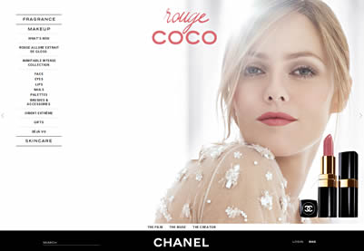
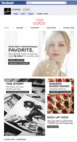
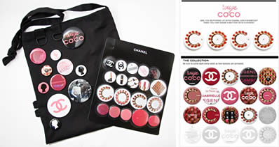
Chanel launched its Rouge Coco campaign this spring, featuring French actress / singer Vanessa Paradis. I like the Facebook effort, where you can share virtual Coco Rouge buttons (a la the press kit / swag bag that was sent out in December) by posting them on your wall. Unfortunately, once the reveal period was over, the buttons are gone.
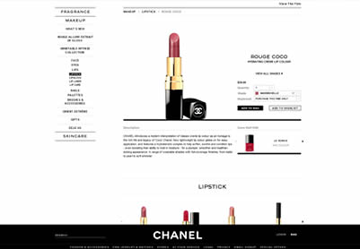
I like that you can browse all the lipstick shades within the Facebook tab but when you click to “Shop Now”, the color you were reviewing didn’t carry through to the e-commerce site. You can see the color name in the URLstring, but you have to reselect the color from the dropdown.
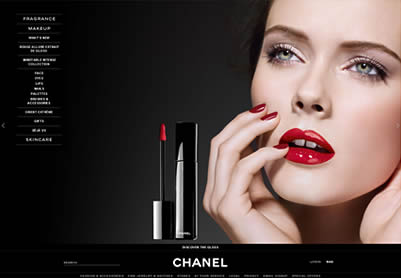
This is too bad because the e-store interface is nicer than a lot of other beauty brands and because the Chanel site is gorgeous with its simple typography, clean layout and stunning photography.
Related post: Beauty brands online: Summer 2010 #1
