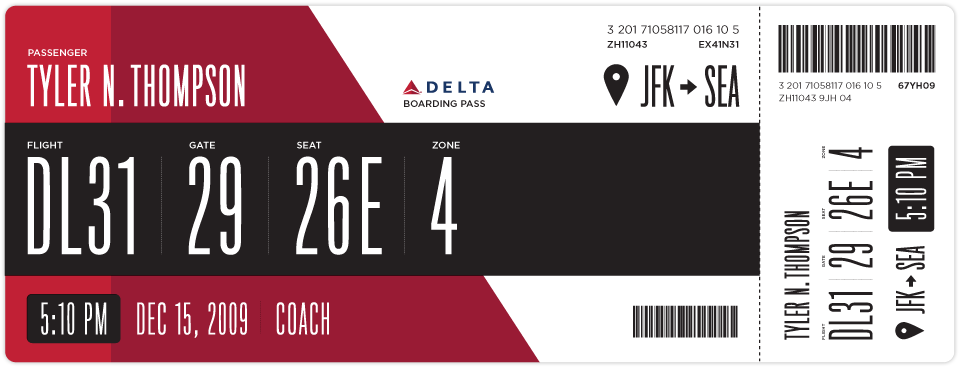
Boarding Pass Redesign
Interesting take on Delta’s ugly boarding pass by Squarespace Creative Director, Tyler Thompson. Last year, he decided to embark on his own take on boarding pass design after looking at his boarding pass at JFK and wondering “what the hell…” The result is a beautiful and well-architected boarding pass design. His initiative invites an interesting conversation by other designers as well as their own redesigns.
I personally like the sketches he did on his moleskin.


